THE DESIGN PROCESS
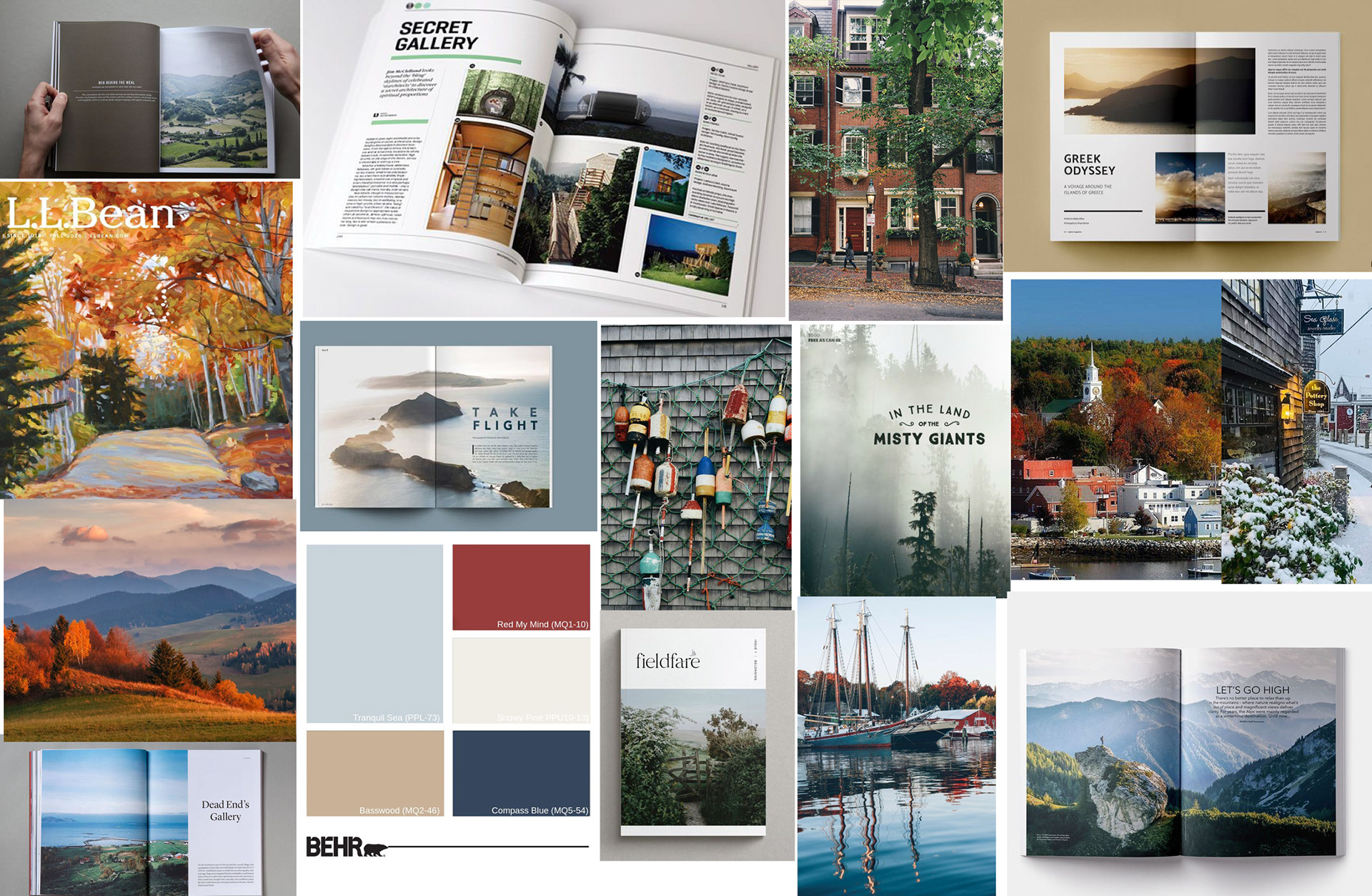
My first step was to create a mood board illustrating ideas for look and feel of the magazine.
The name of the magazine was defined as "New England Travel" and I designed a masthead that aligned to the look and feel.
I chose to use two type faces and make 'New England' the more prominent part of the name as the content will be exclusive to that area of the country. The New England typeface is Birthstone regular weight, chosen because of its mix of formal and casual elements. 'Travel' is set in all capitals in Candara Light, a clean sans serif complement. Together, the works are set right justified with 'Travel' tucked within the negative space after the g descender.

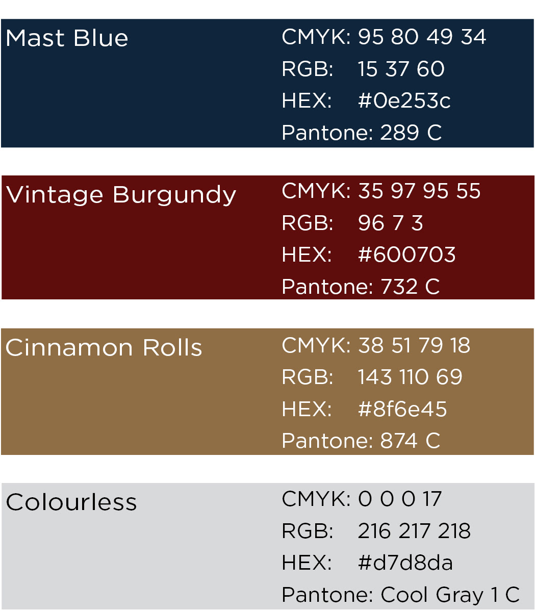
The color palette includes deep, slightly muted shades of navy, burgundy and gold - all colors generally associated with New England. The Masthead would always be shown in Mast Blue.
The typography was chosen for the interior of the magazine to keep the New England feel but protect readability and legibility.
Proxima Nova was used for headlines and sub-headlines.
Proxima Nova
ABCDEFGHIJKLMNOPQRSTUVWXYZ
abcdefghijklmnopqrstuvwxyz
1234567890
,.?!@#$%^&*()
National Park was used for body copy.
National Park
ABCDEFGHIJKLMNOPQRSTUVWXYZ
abcdefghijklmnopqrstuvwxyz
1234567890
,.?!@#$%^&*()
A content plan was created covering the first 8 issues (2 years) using the following criteria:
1. Cover stories needed to be supported by photography in my collection to eliminate licensing concerns and to ensure availability of high resolution supporting images.
2. All feature articles should be seasonally appropriate and not repeated across years.
3. There needed to be a mix of locations in each issue (different parts of New England represented).
4. There needed to be some variation in the type of activities presented.
2. All feature articles should be seasonally appropriate and not repeated across years.
3. There needed to be a mix of locations in each issue (different parts of New England represented).
4. There needed to be some variation in the type of activities presented.
Following the mood board and the content plans, I did some rough sketches to plan page layouts.
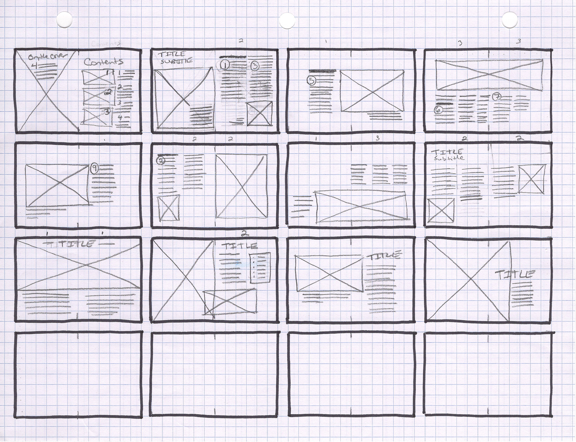
As I moved into InDesign to do digital layouts, I defined a 6x6 grid to organize the content
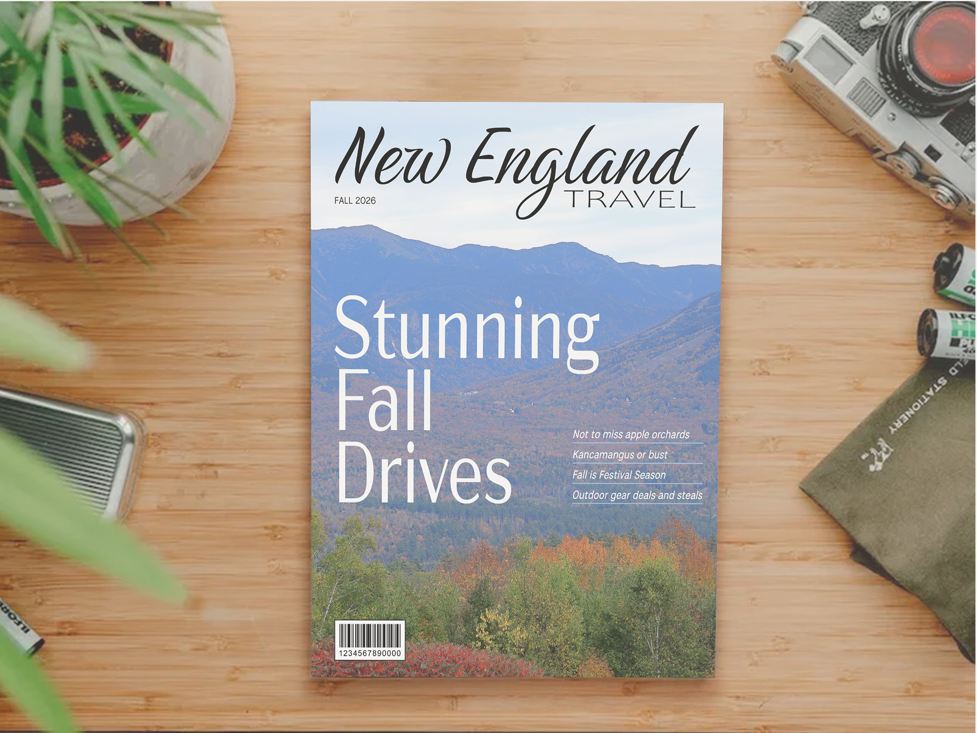
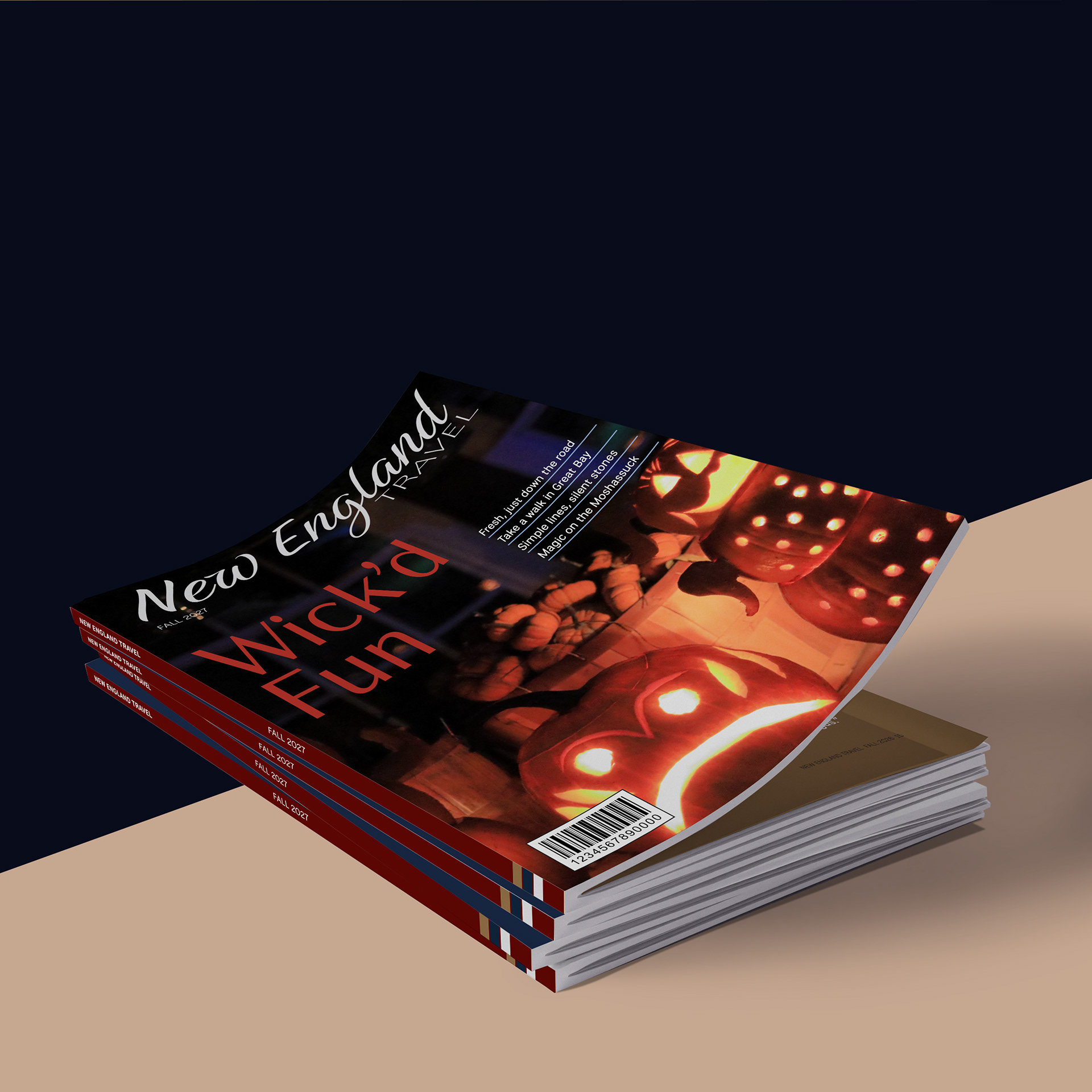
COVER FINAL DESIGN
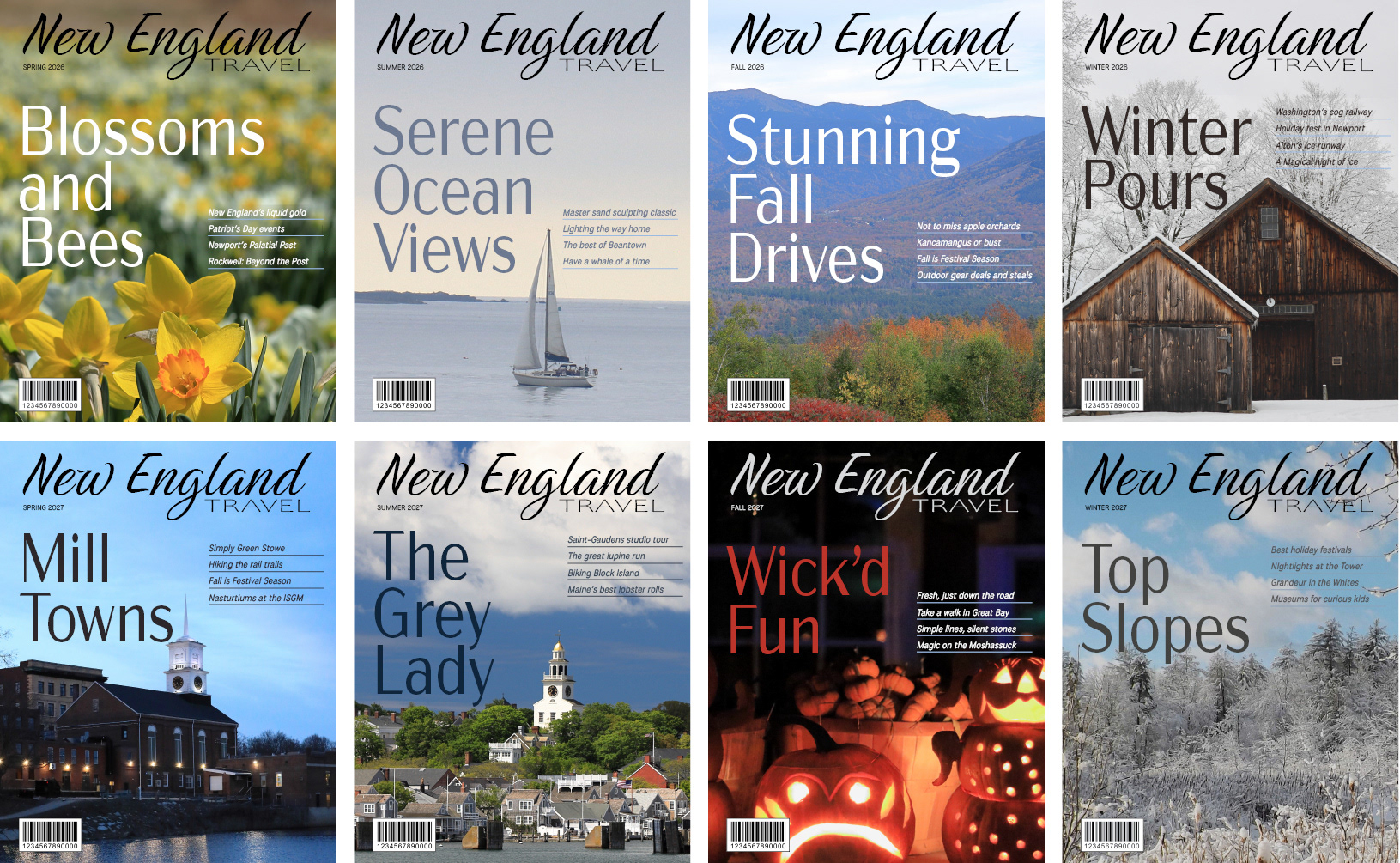
The cover system has a full-bleed landscape photo overlayed with article titles in white text (or from a color in image as required for appropriate contrast).
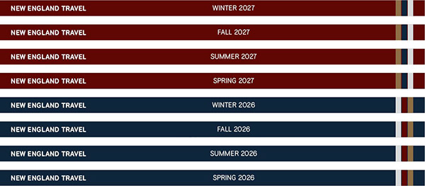
The spine has name and issue in all capitals and white text. The spine background will be a brand color with the alternate brand colors as an accent trio set.
The back page will be reserved for advertising. For the prototype, a full-page ad was designed as a recreation of the current Maine tourism campaign using a photograph from my personal collection.
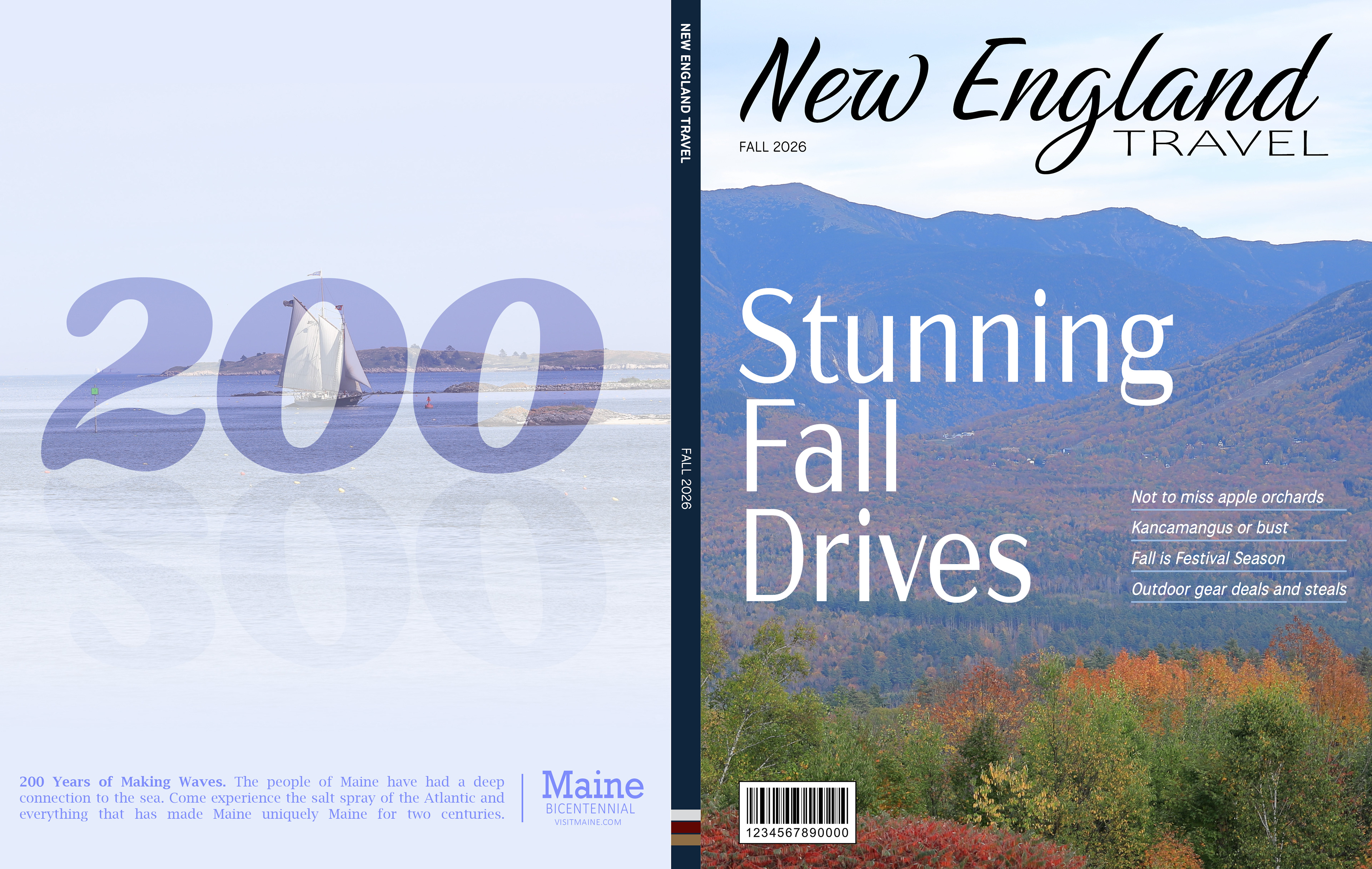
The cover system supports a consistent look and feel across issues.
The spine system will rotate background colors each year. There are 4 defined colors in the palette - the entire system will repeat after 16 quarterly issues.
INTERIOR PAGES FINAL DESIGN
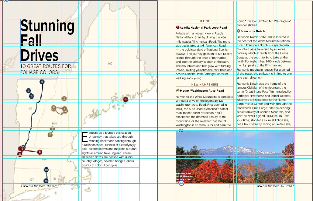
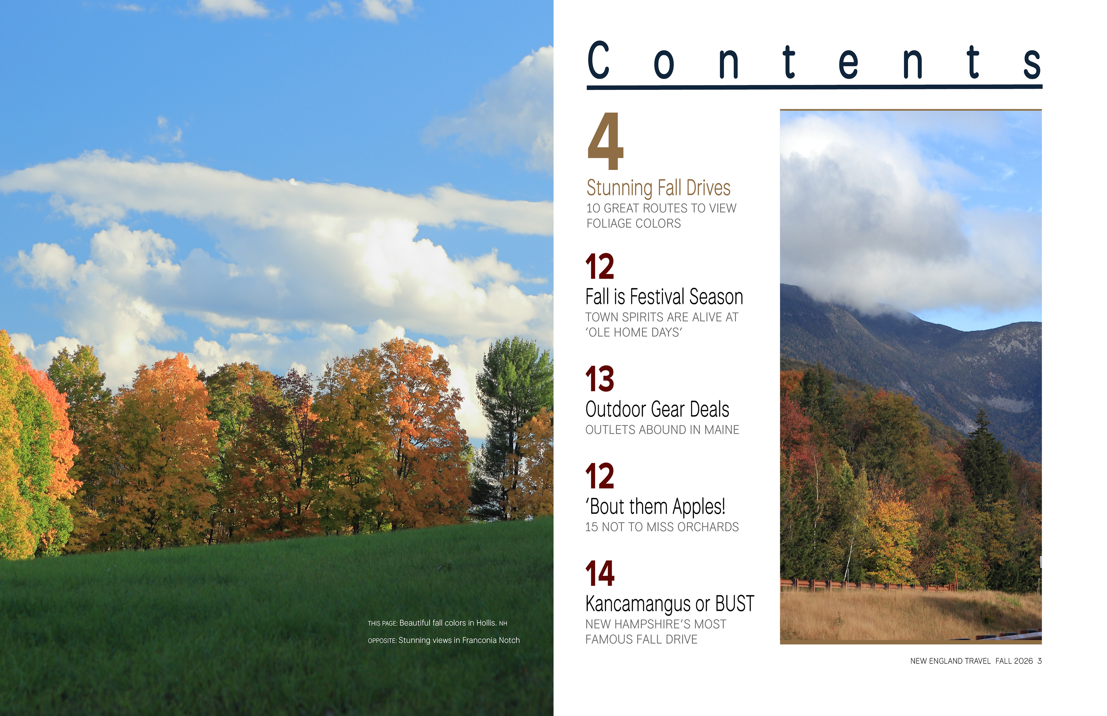
The table of contents is always included in the first spread with a full-bleed photo on the verso page. The feature article is highlighted with a larger number and contrasting text color.
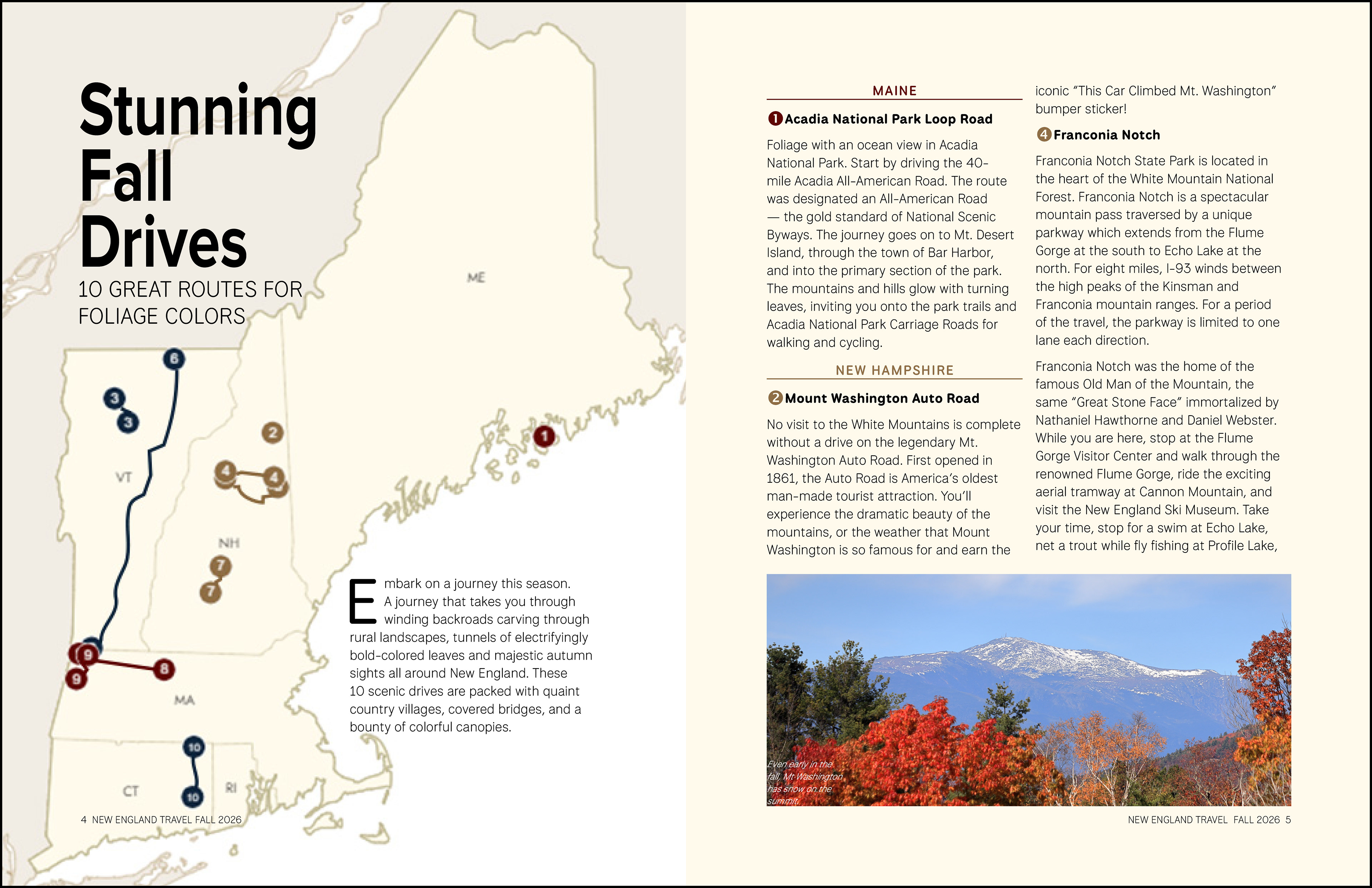
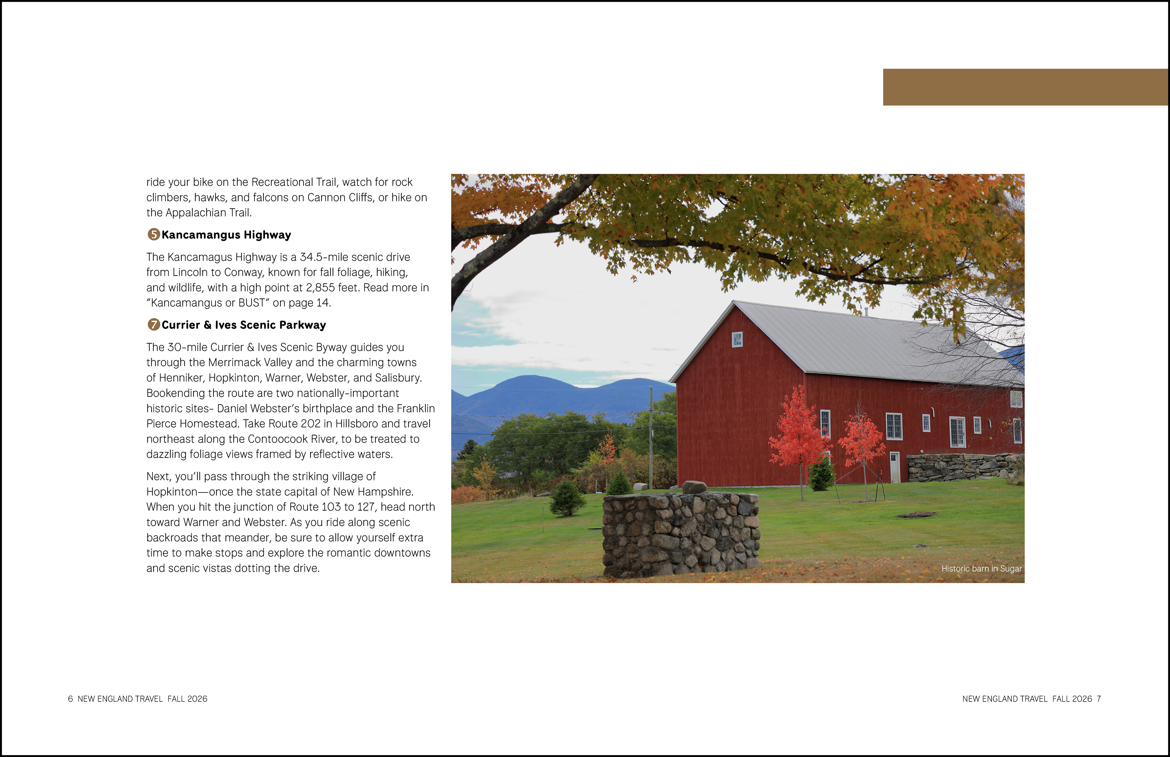
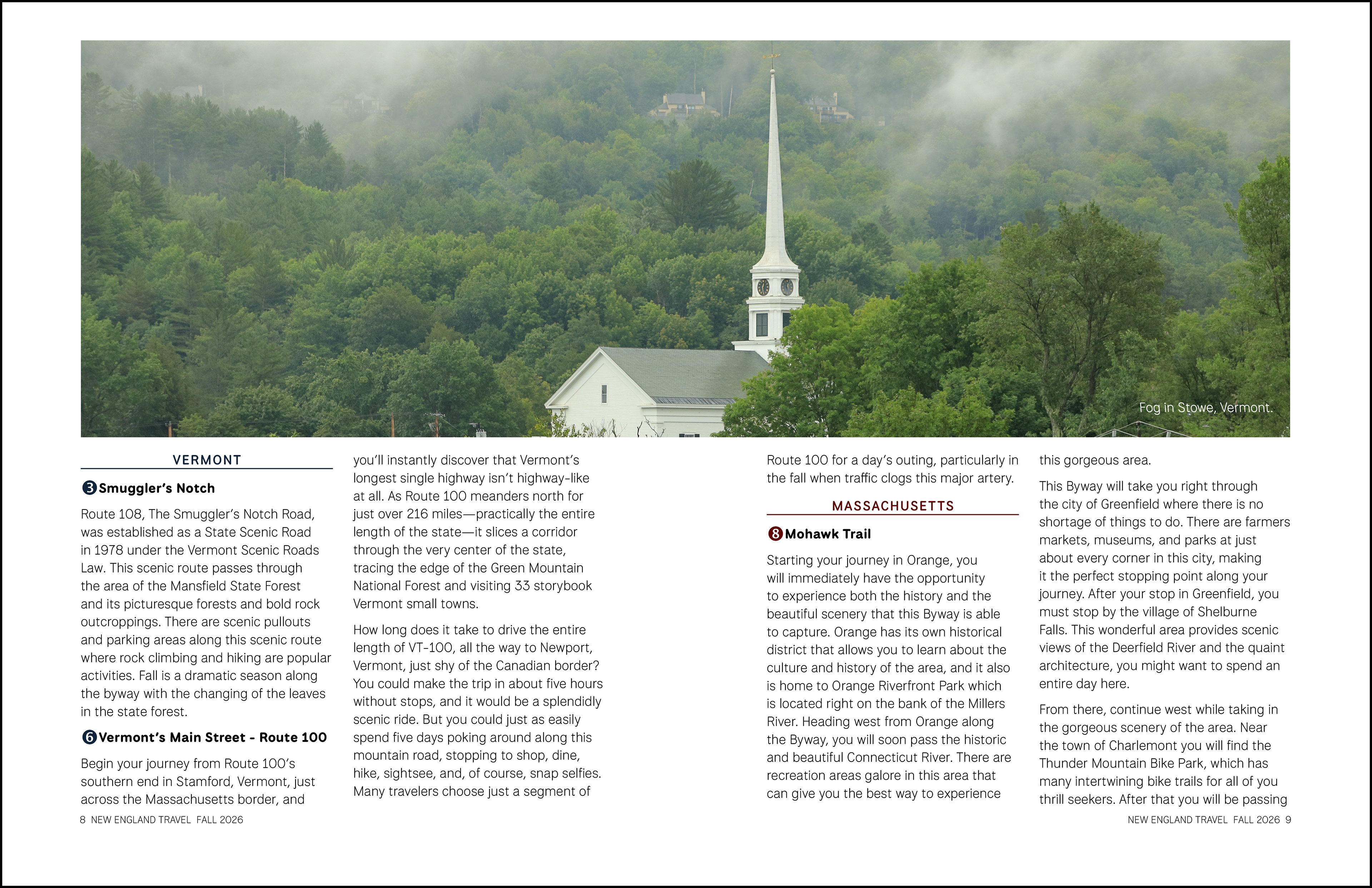
Interior pages feature full-bleed photography and clean, open typography. Articles are supported by pull-quotes and illustrations as needed. Throughout the magazine, the color palette is represented in color text and highlights.
A new travel magazine - New England Travel - designed by Wendy Steckler.
The flip book below illustrates how the magazine presents to a reader.