Infographic design featuring original icons and logo for L.L.Bean by Hollis, New Hampshire graphic designer Wendy Steckler 

Maine travel infographic designed by Wendy Steckler Designs
The goal was to develop a visual identity and destination campaign that connects L.L.Bean's outdoor heritage with Maine travel, using a refreshed logo, custom illustration and an infographic-based campaign system.
BRAND IDENTITY DESIGN PROCESS
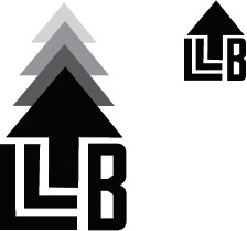
The current logo is shown below and the image above illustrates the new design.
Original L.LBean logo

Original L.LBean logo

The first step in the design process for the logo was to assemble a mood board for the new  brand identity. 
L.L.Bean has a unique value proposition as the one of the oldest retailers in the United States (founded in 1912). Steeped in history and family-run for nearly a century. L.L.Bean's brand identity has positioned the company as approachable and accessible. 
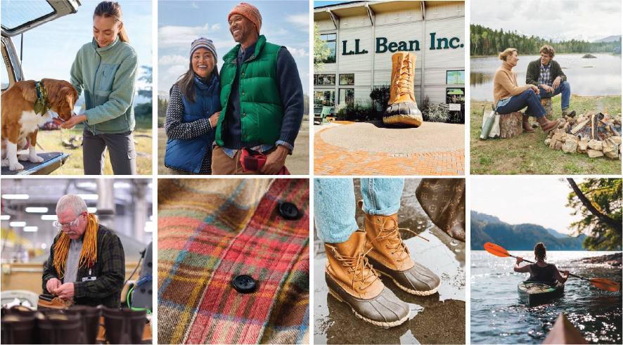
In 2019, L.L.Bean kicked off a brand revitalization project and the takeaway from their research findings is that they identified a new target market - outdoor family enthusiasts. This customer is looking for products in which form follows function, is energized by the outdoors, identifies family together time as the best time.
Moodboard of images of L. L. Bean clothing, home store and production process used in logo redesign process.
Moodboard of images of L. L. Bean clothing, home store and production process used in logo redesign process.

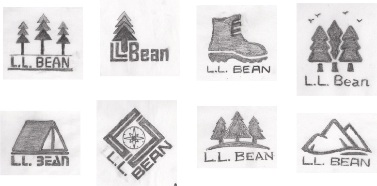
Hand-drawn explorations were drafted illustrating several options for the new logo. The drawings focused on including visual elements that are generally associated with being outdoors (landscapes, trees, compass, boots and tent).  The boot is an iconic symbol of L.L.Bean used prominently today.
Hand-drawn sketches of L.L.Bean logo redesign concepts by Wendy Steckler Designs
Hand-drawn sketches of L.L.Bean logo redesign concepts by Wendy Steckler Designs

The goal of the redesign was to provide an updated feel for the brand that would be appealing to the target audience (all families who enjoy the outdoors including those for whom outdoors just means their backyard). Several concepts were abandoned as too specific or limiting (the compass, camping and the mountains). The second from the top has visual elements that are more suggestive than explicit and was chosen as the most appropriate concept to refine.

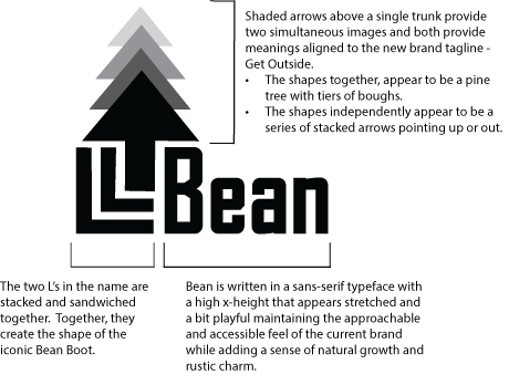
L.L.Bean brand refresh and logo redesign details by Wendy Steckler Designs
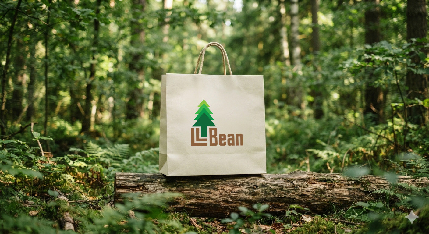
The primary brand identity is a combination mark with two elements; an icon and a wordmark. The icon serves as a reference to the outdoors and the wordmark provides the corporate identification.
BRAND VISUAL SYSTEM
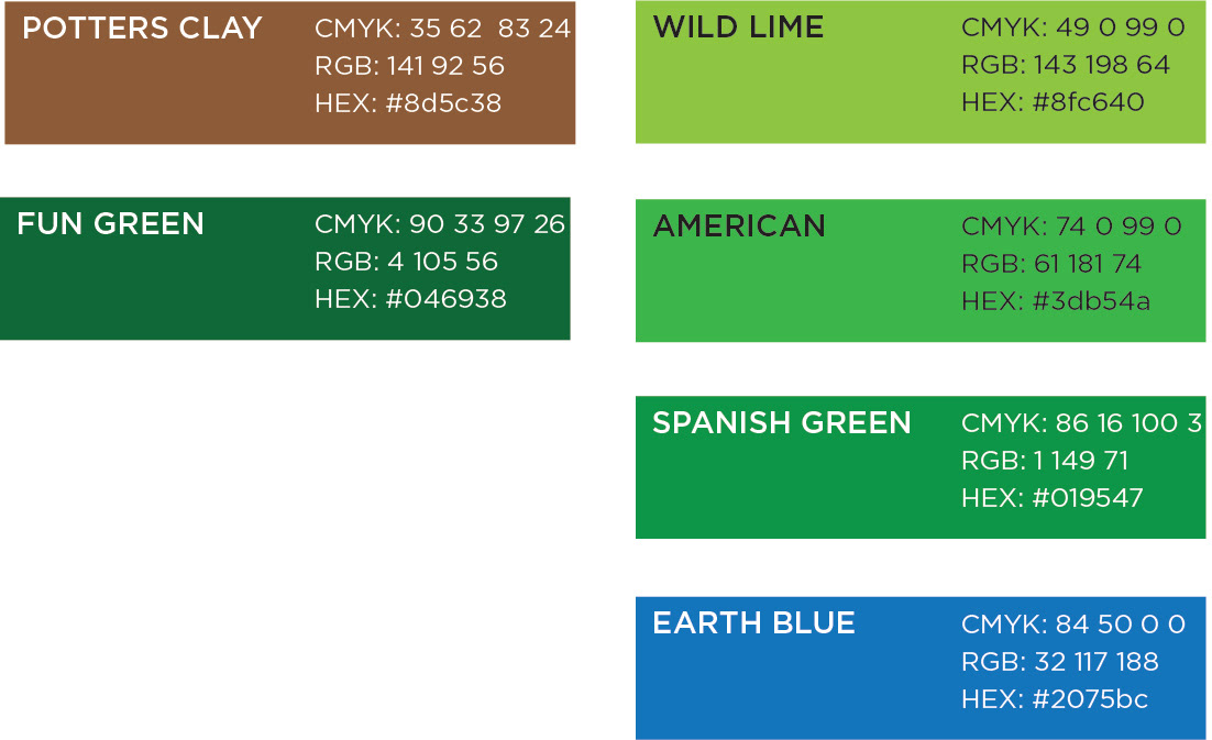
Brand colors were selected that reinforce the sense of the outdoors and playful nature of the new brand image.
The primary colors are brown and green with various shades of green dominating the secondary palette.
Oswald Heavy Black was chosen as the best type for headlines and sub-headlines to convey the fun, playful and warm nature of the brand. Its vintage-feeling woodblock proportions feel rustic and organic.
Montserrat was chosen as the best complement for body copy, and used primarily in light weight providing a nice contrast from the narrow and heavy headline typeface.
Alternative logo versions were designed, ensuring consistent brand identity across all assets and implementations.
Below, an abbreviated logo for vertically oriented and favicon uses.

Alternative versions of the refreshed L.L.Bean logo design by Wendy Steckler Designs.
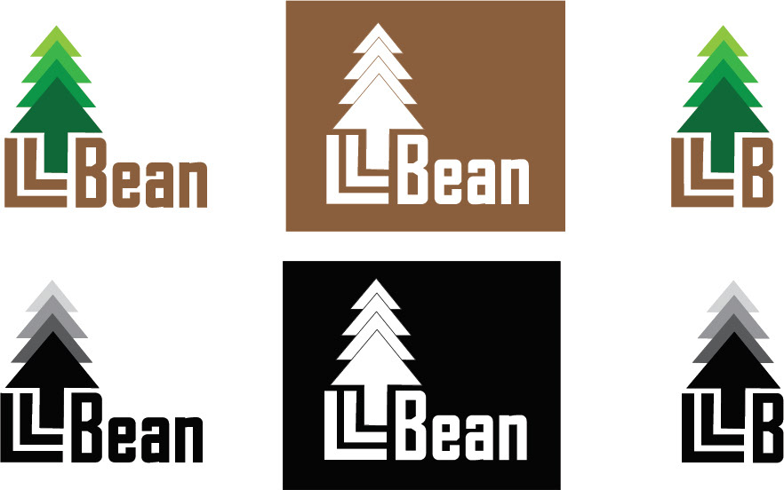
And a preferred full-color version and reversed for use on color backgrounds.

Alternate applications of the refreshed L.L.Bean logo design by Wendy Steckler Designs
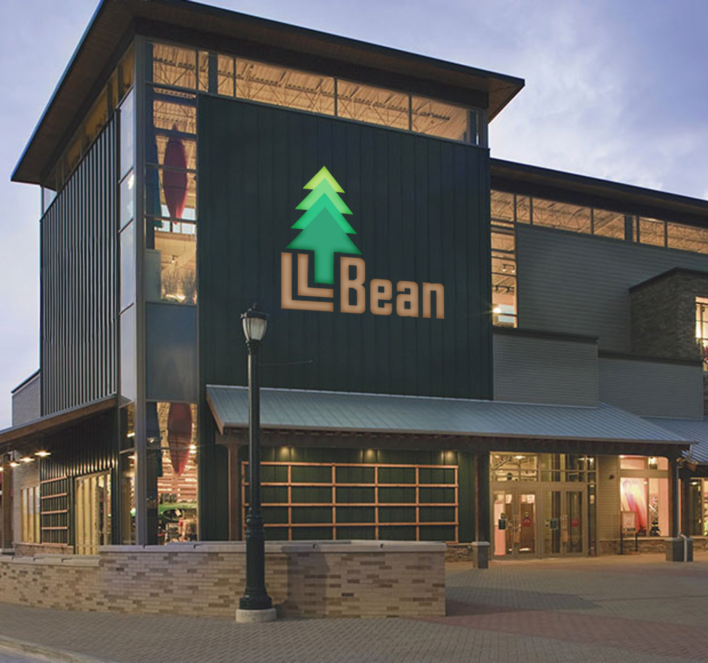
APPLIED LOGO EXAMPLES
Reimagined L.L. Bean logo by Wendy Steckler Designs on a store front.
Reimagined L.L.Bean logo by Wendy Steckler Designs on a store front.

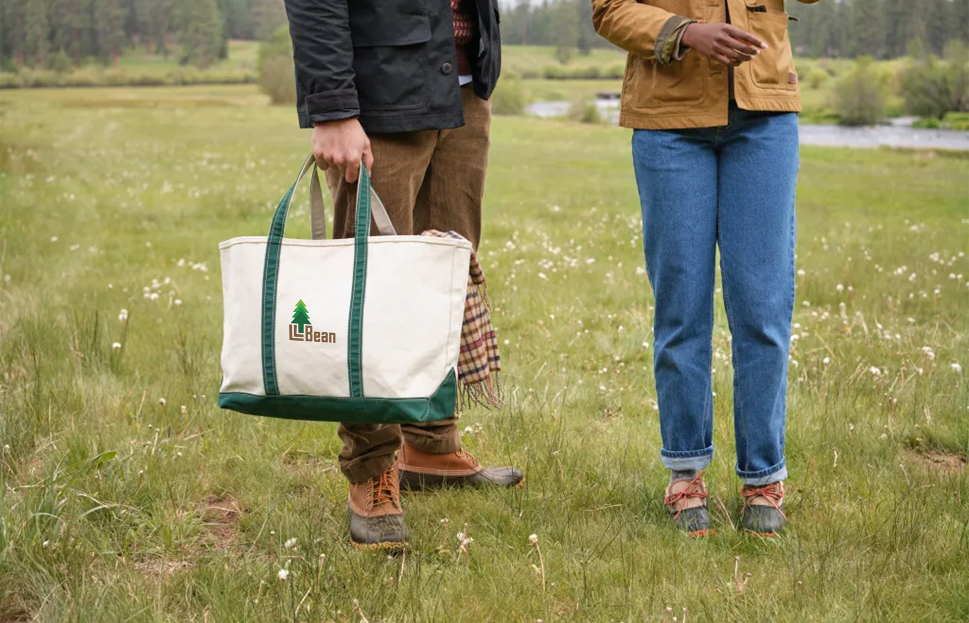
Reimagined L.L. Bean logo by Wendy Steckler Designs on a canvas bag held by a man wearing L.L.Bean boots in a field

Reimagined L.L.Bean logo by Wendy Steckler Designs on a canvas bag.
CAMPAIGN DESIGN PROCESS
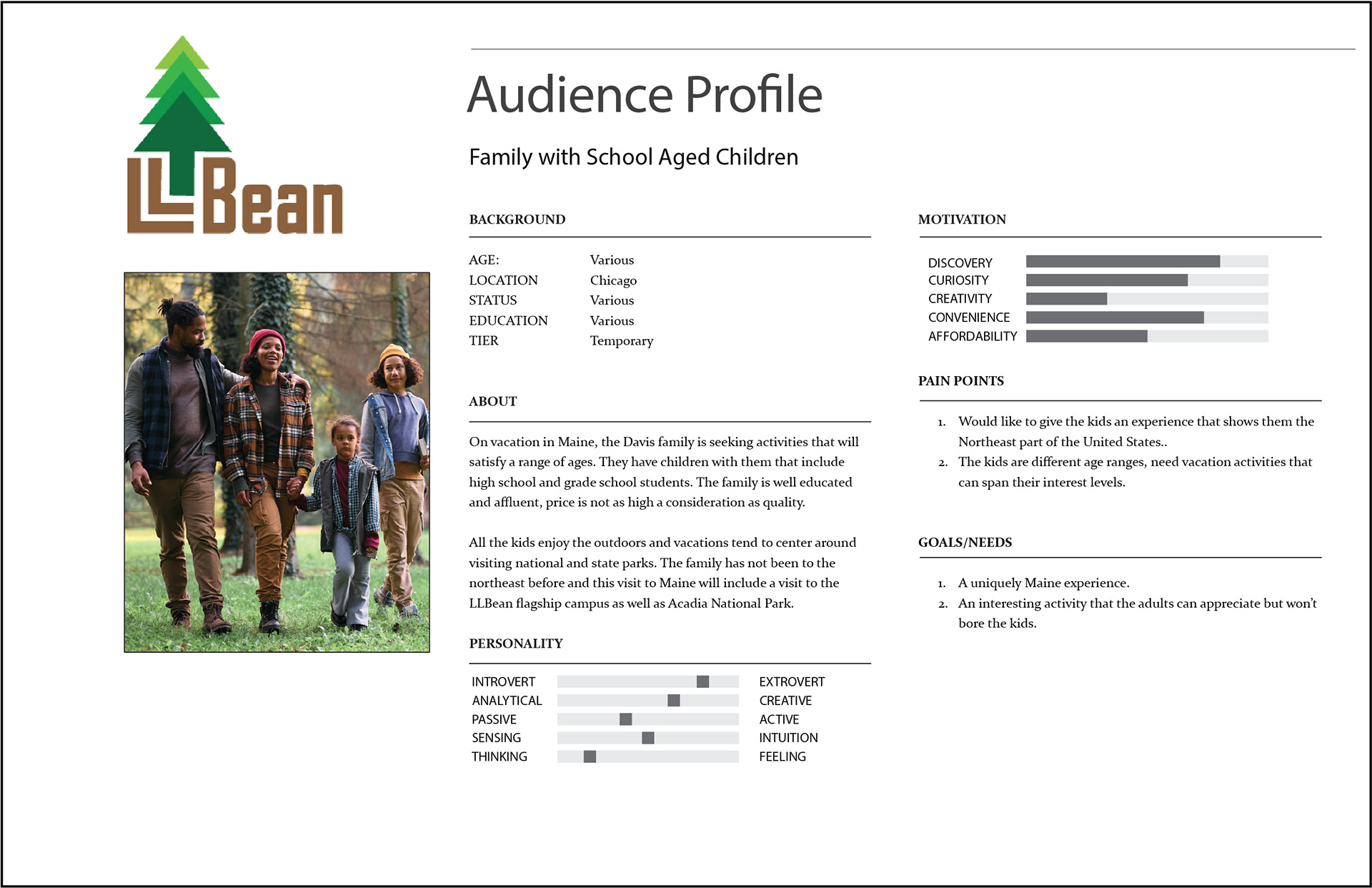
In conceptualizing a speculative campaign with Maine Travel & Tourism, several key audience profiles were identified. Below is the example for a family traveling to Maine on vacation that embodies the main target audience. The campaign concept was to promote the different activities and things to do in the state of Maine, including visit the L.L.Bean flagship store and campus.
The audience profile led to a campaign direction centered on accessible outdoor activities, family travel and recognizable Maine destinations rather than extreme or technical outdoor recreation. The campaign will promote specific activities and provide details to incorporate them as part of a travel itinerary (location, key facts, etc.)
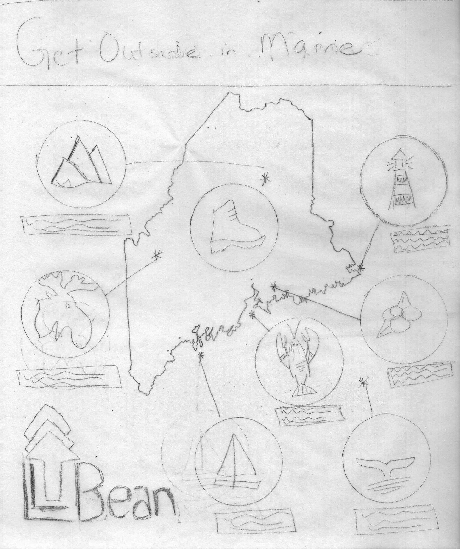
A rough version of the main hero and supporting icons were hand-drafted to illustrate and test the overall concept of the State of Maine surrounded by location-based activity call-outs.
Hand-drawn sketch of Maine travel infographic design by Wendy Steckler Designs.
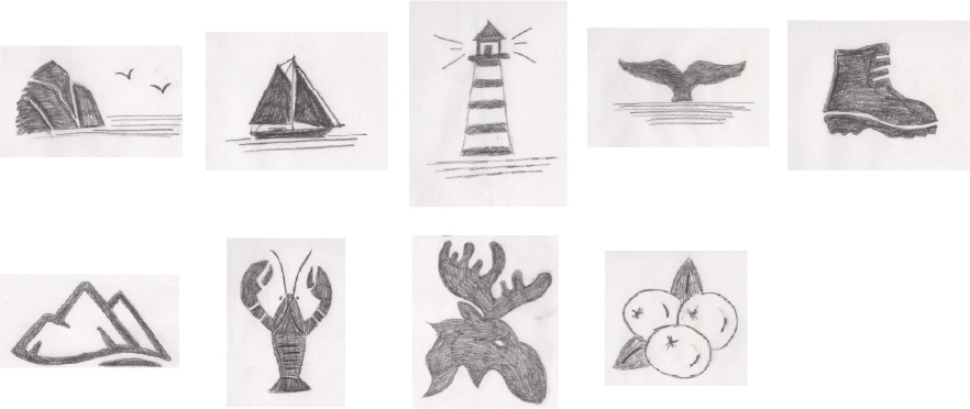
Hand-drawn sketch of Maine travel infographic design by Wendy Steckler Designs.

Hand-drawn sketches of Maine travel icon designs by Wendy Steckler Designs.
Hand-drawn sketches of Maine travel icon designs by Wendy Steckler Designs.

The L.L.Bean color 'Fun Green' was chosen for use as the main thematic color in the campaign.
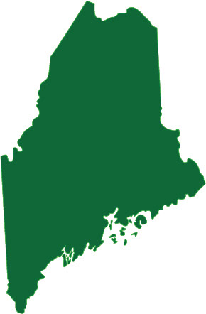
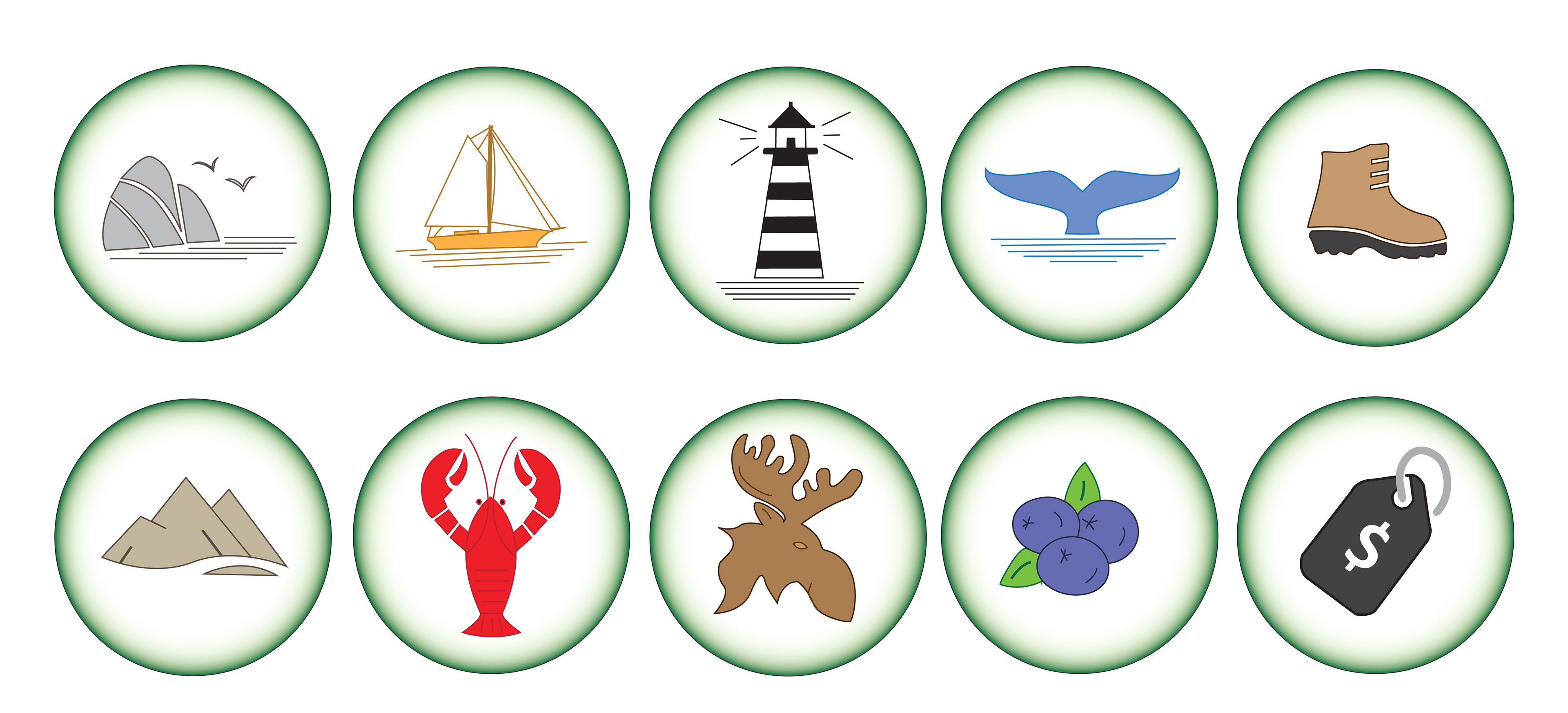
The state of Maine and icons were refined via computer draft. The icon system uses a badge-inspired treatment as a visual nod to childhood outdoor experiences and collecting travel memories. To ensure the icons appear as a cohesive set, line thickness, detail and size were all reviewed for alignment and consistency.
Maine travel icon designs drawn with Adobe Illustrator by Wendy Steckler Designs.

Maine travel icon designs drawn with Adobe Illustrator by Wendy Steckler Designs.
FINAL CAMPAIGN DESIGNS
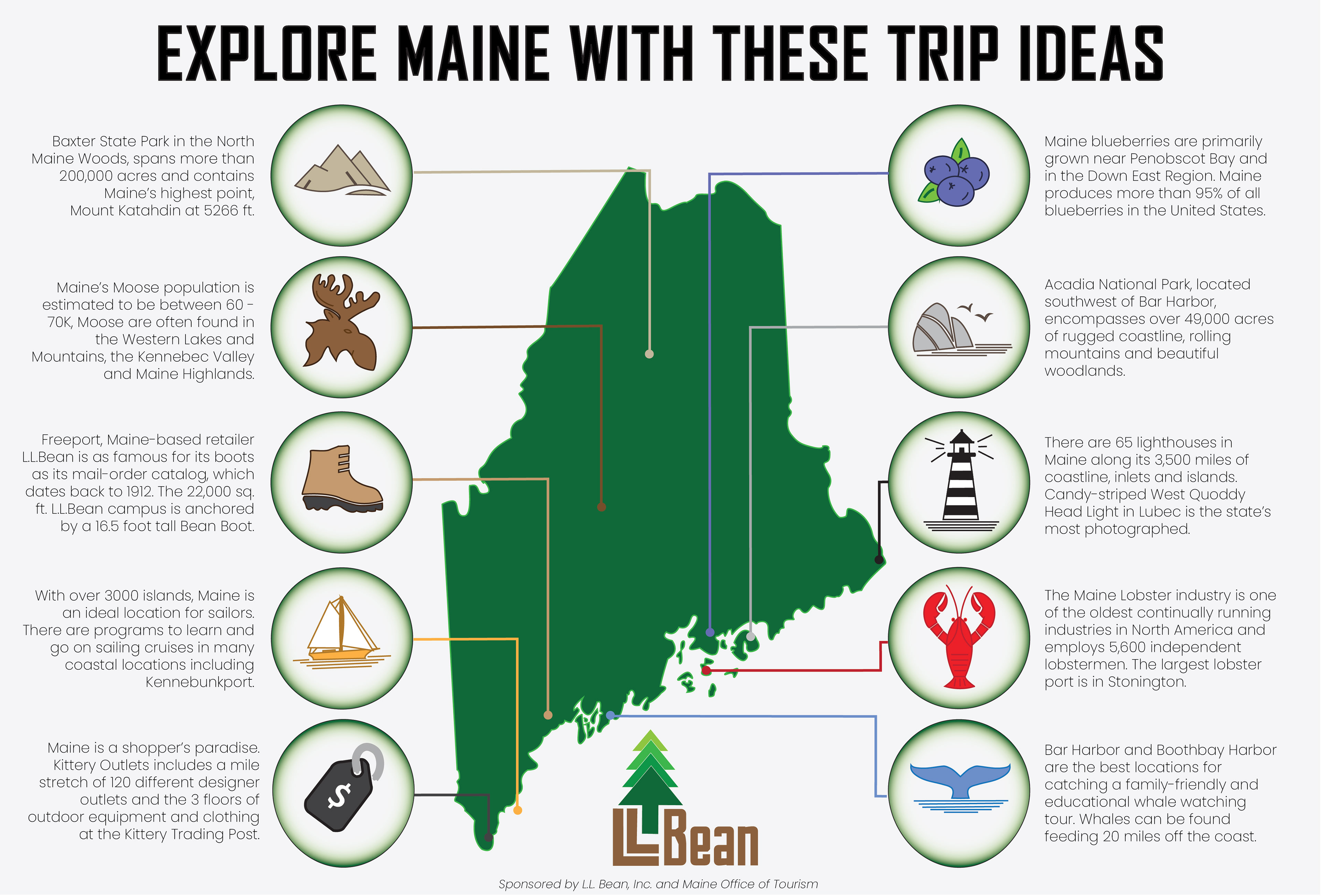
An infographic was assembled illustrating all the locations of 12 different activities to do in the state of Maine with geographic identification and additional text details. This infographic is designed for use as part of larger campaign assets or alone as a poster or interactive web landing page.
Final co-branded infographic from the State of Maine Travel & Tourism and L.L. Bean designed by Wendy Steckler Designs.

Speculative co-branded infographic for L.L.Bean and Maine Travel & Tourism designed by Wendy Steckler Designs.
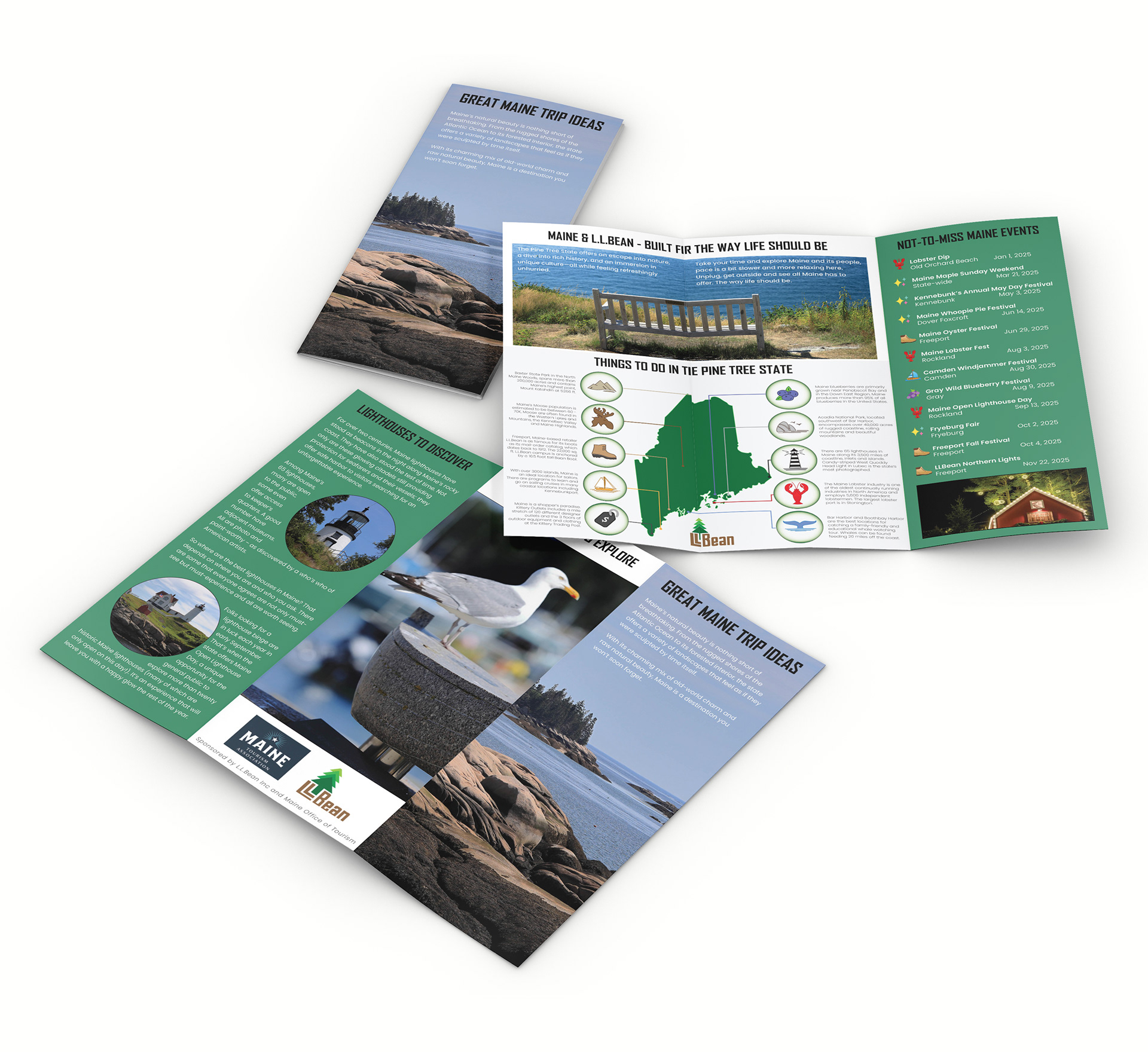
The infographic design was incorporated into a three-panel brochure design. This three-panel brochure is intended to be given away at hotels and travel plazas.
Final co-branded tri-fold brochure from the State of Maine Travel & Tourism and L.L. Bean designed by Wendy Steckler Designs.

Speculative co-branded infographic for L.L.Bean and Maine Travel & Tourism designed by Wendy Steckler Designs.
ADDITIONAL DESIGNS

↑Back to Top