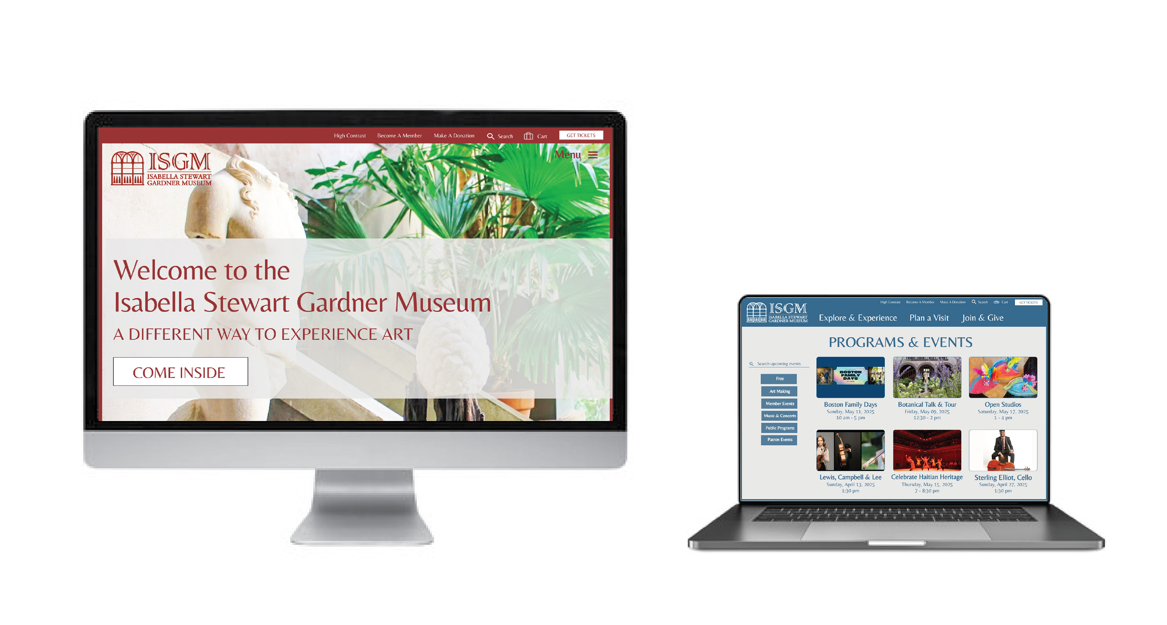
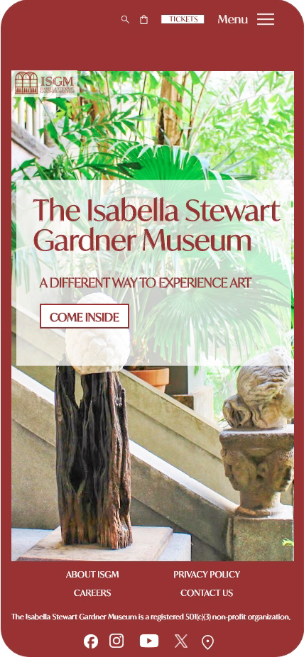
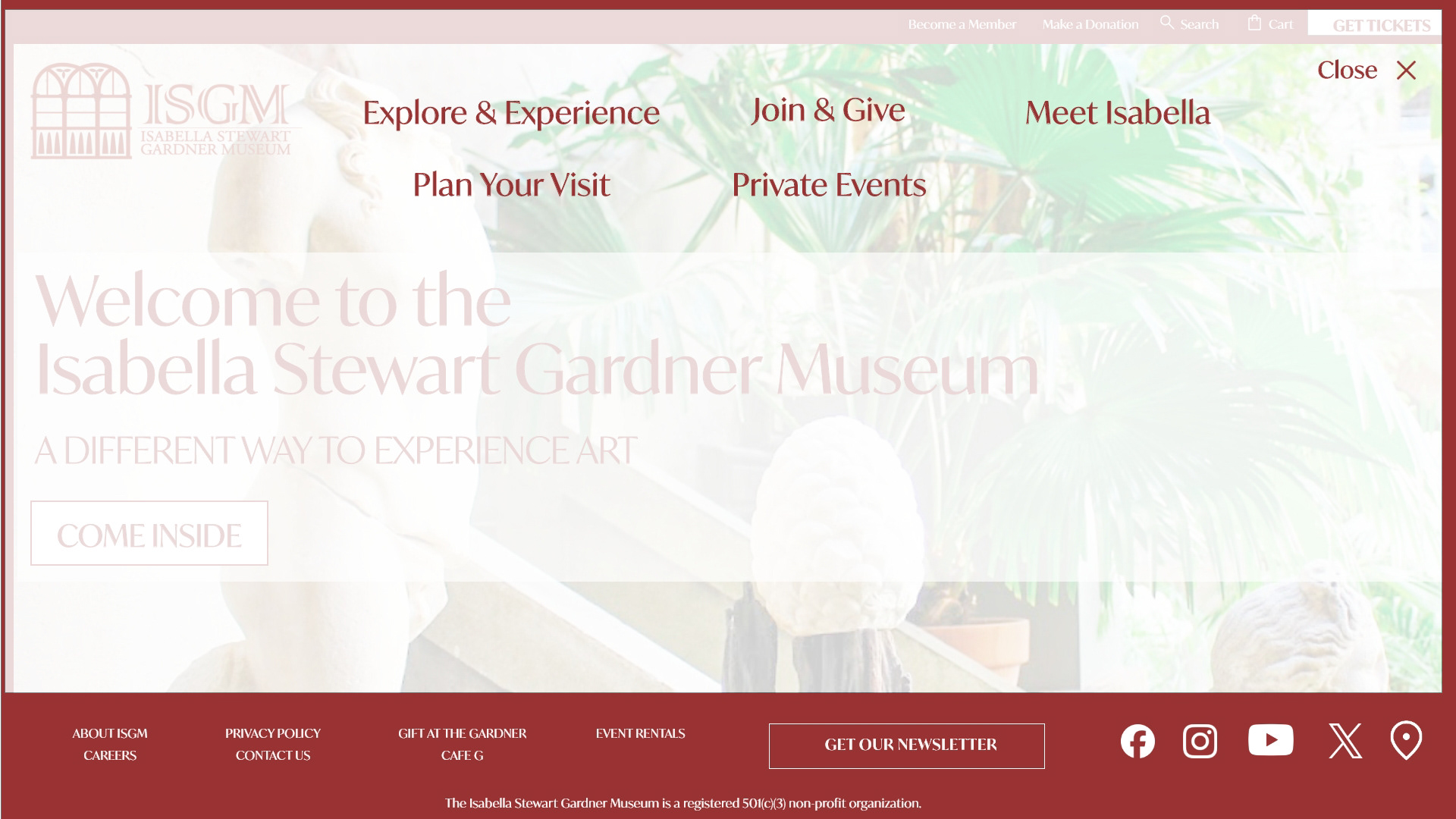
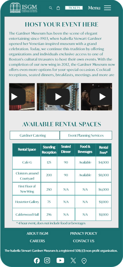
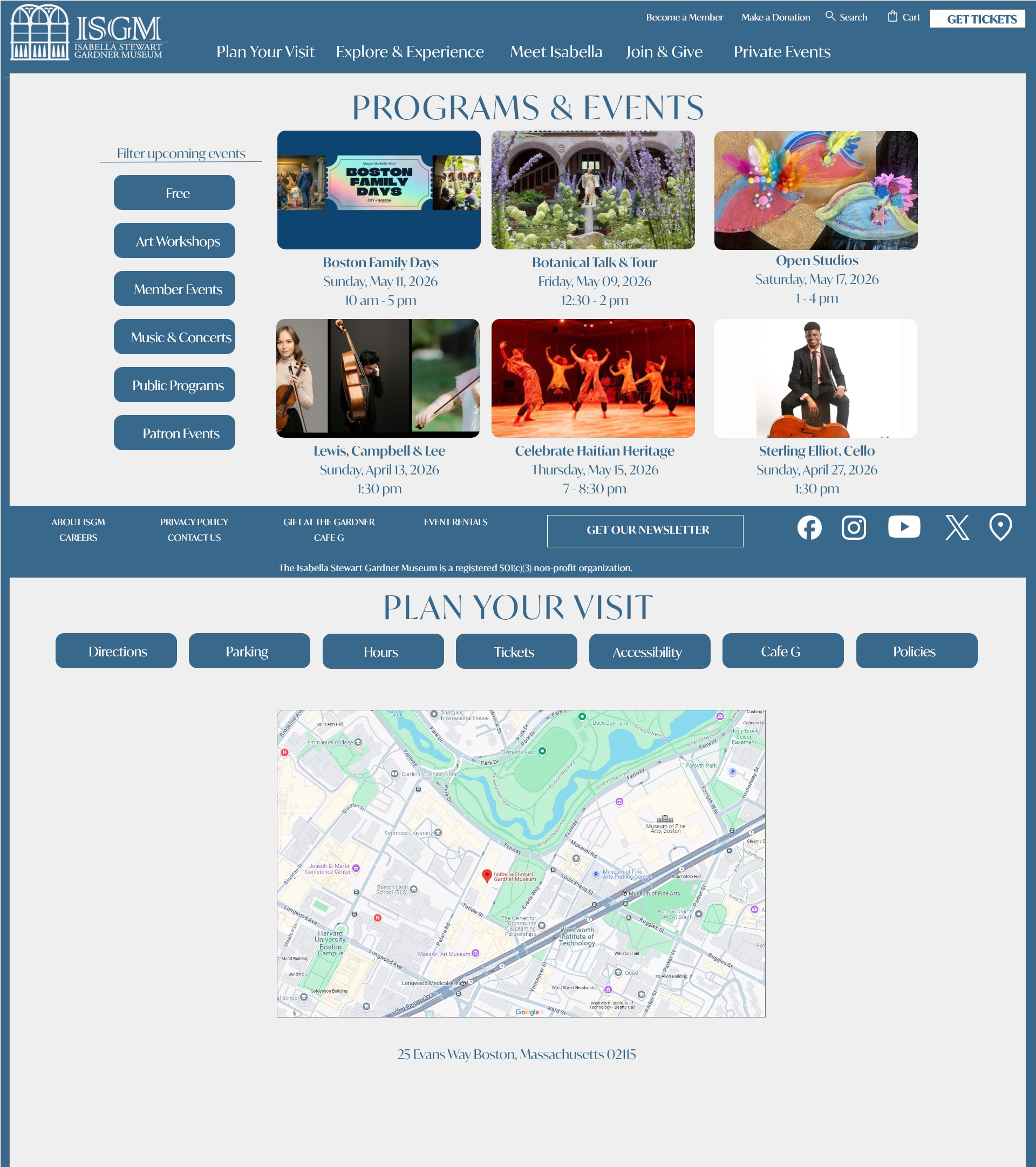
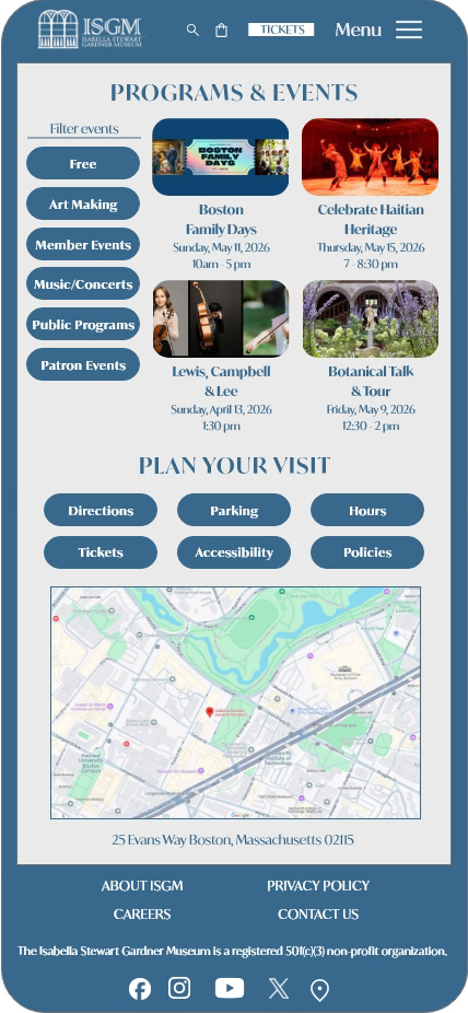
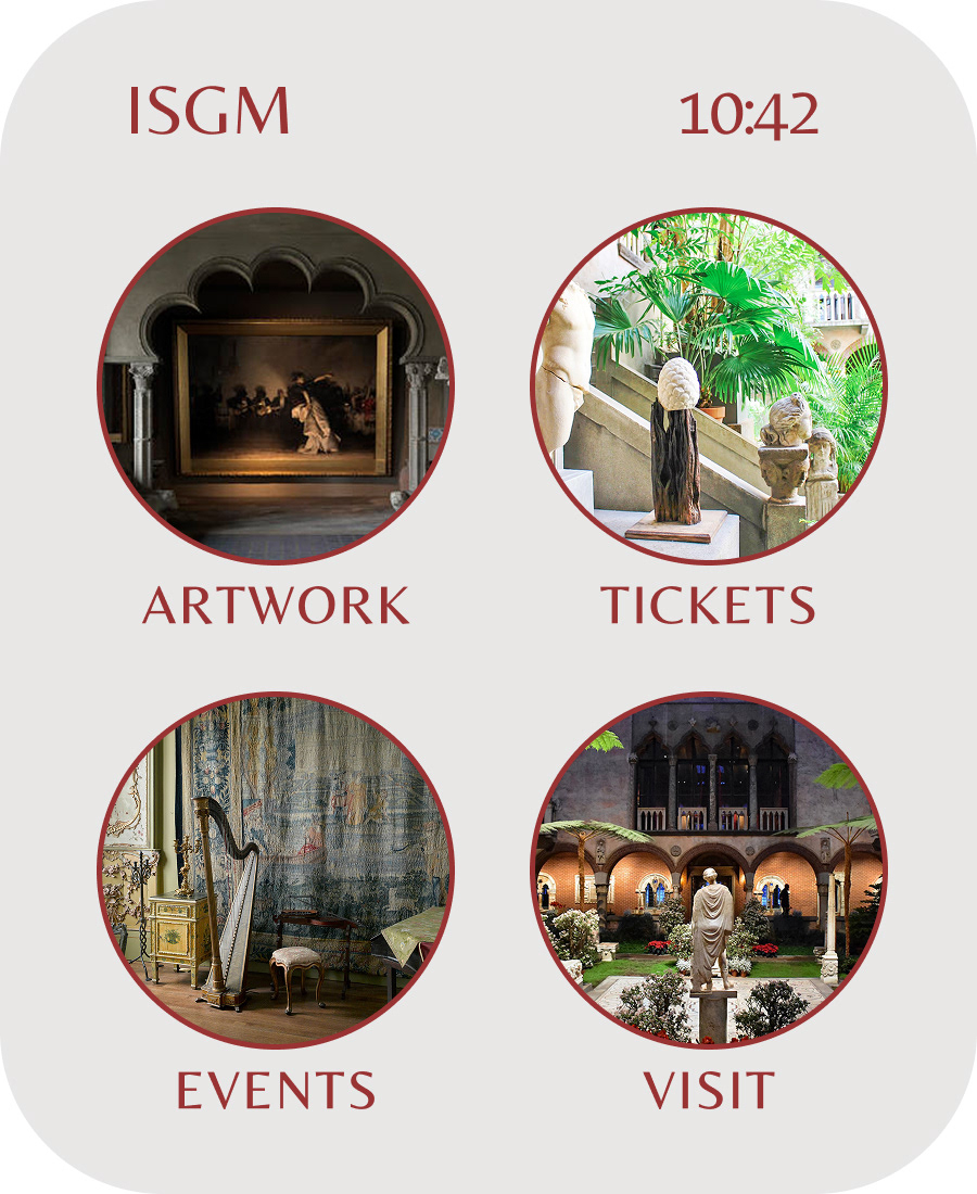
Views of the updated landing page design an events page as shown on desktop/laptop.
THE DESIGN PROCESS
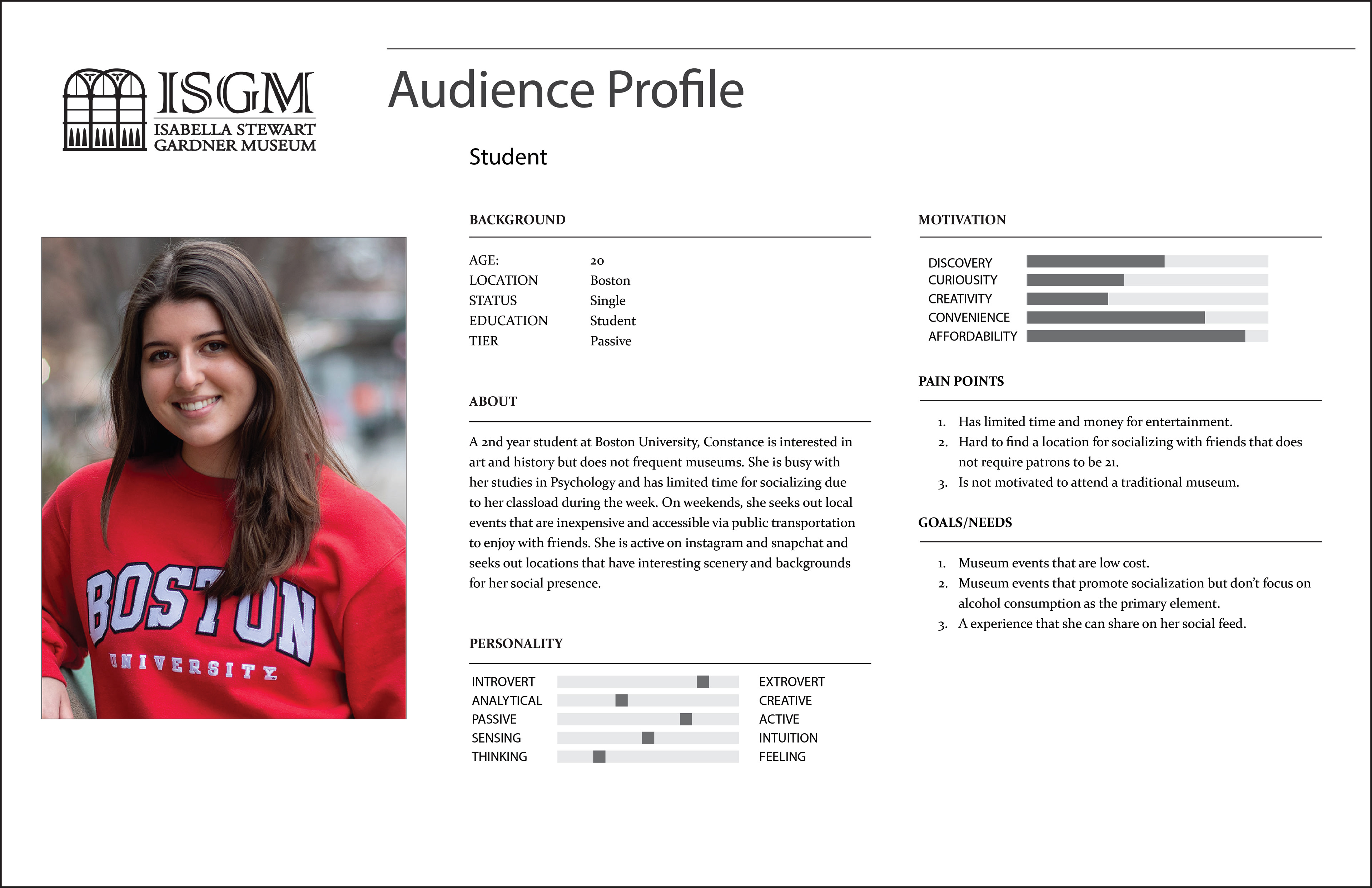
In designing the updated website, the first step was to identify user profiles and journeys. Below is an example of the details for a Boston University student.
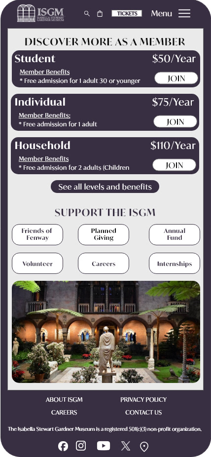
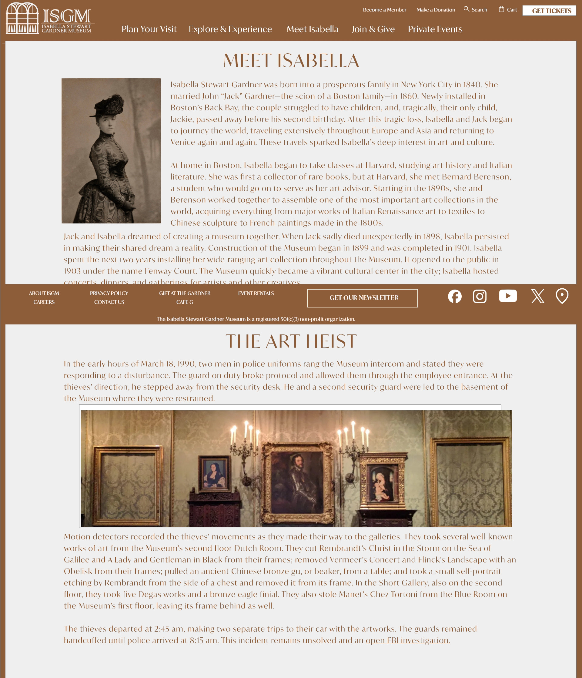
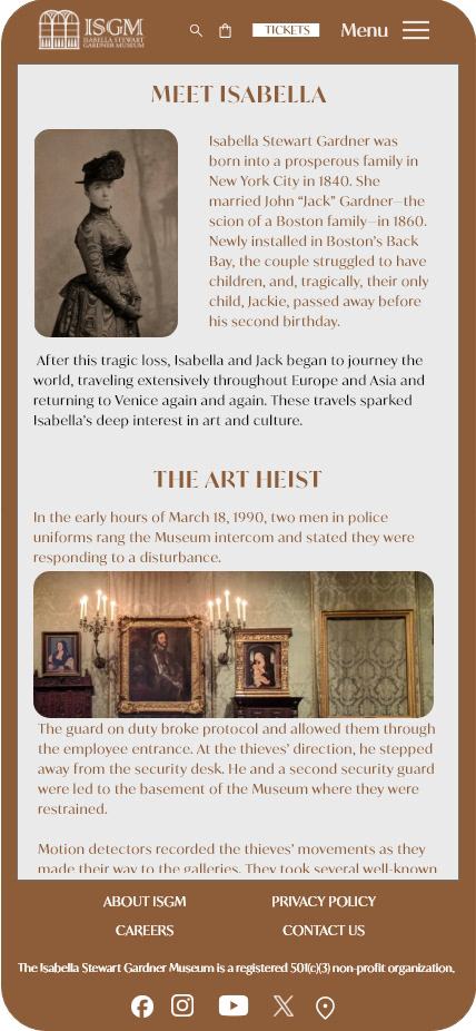
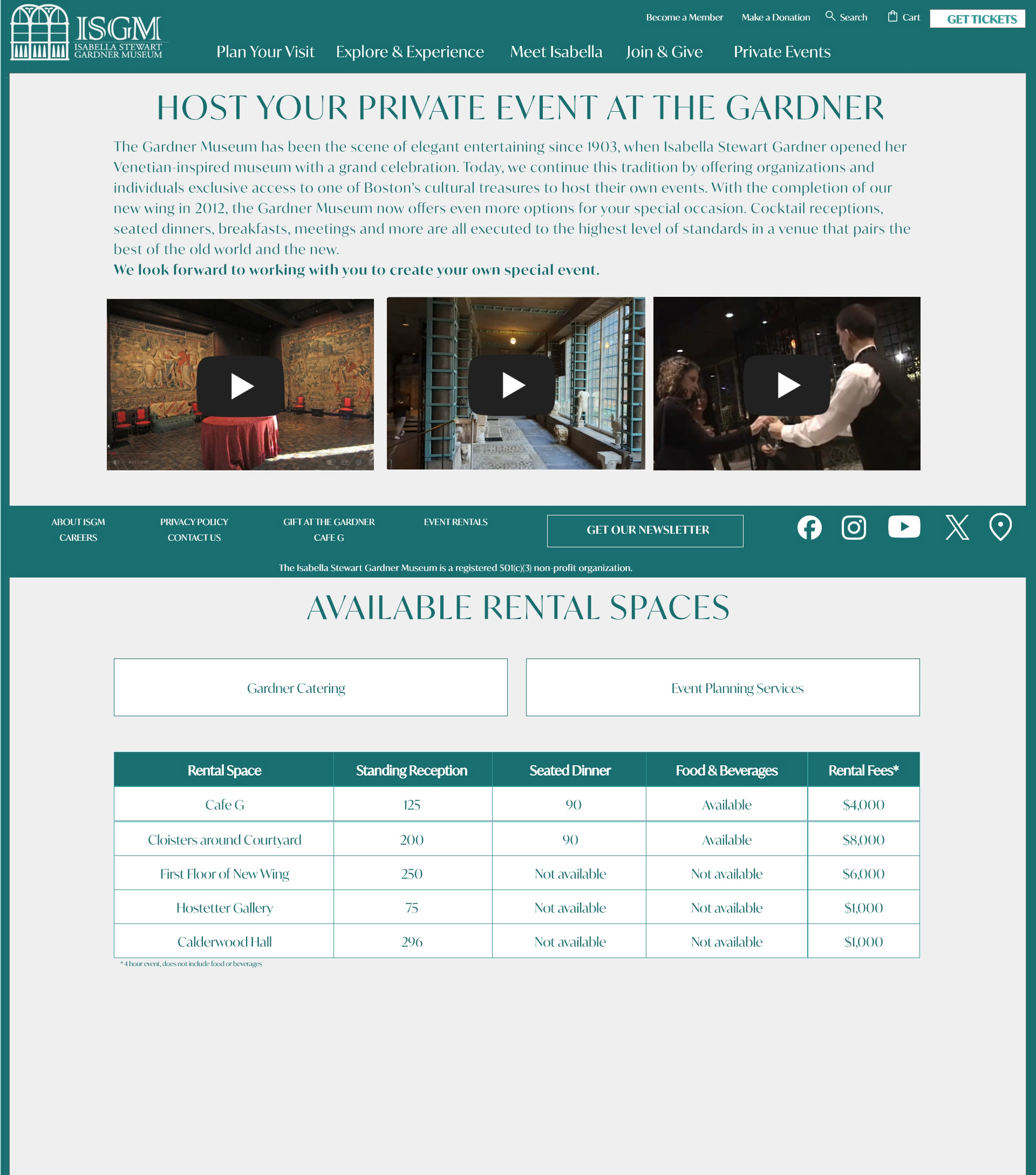
Several screens of content were identified to promote membership, provide details for planning a visit, content related to historical facts, a page highlighting reels of featured images and information about arranging private events.
A 12 column grid was used to plan content placement
12 column grid for content placement
12 column grid for content placement
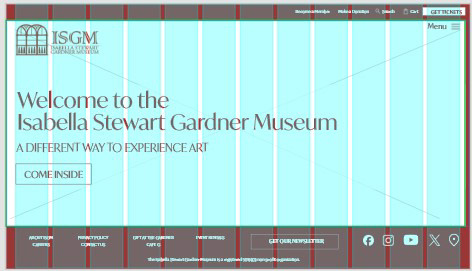
Adobe XD was used to design wireframes and prototype basic screen interactions.
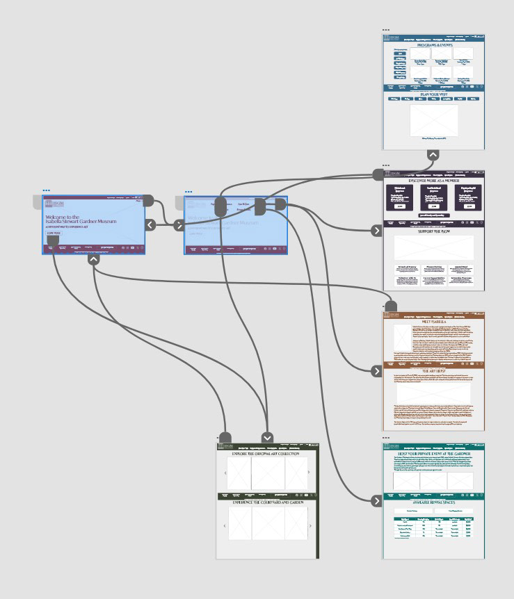
Prototyped interactions for the pages on the new ISGM website.
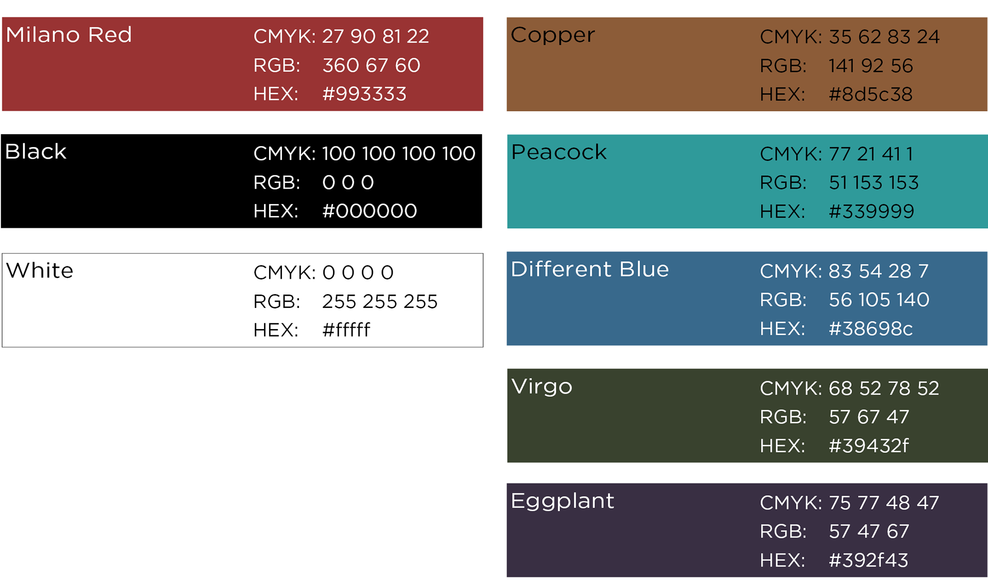
The color palette and typography were aligned to the brand guidelines set as part of the logo redesign.
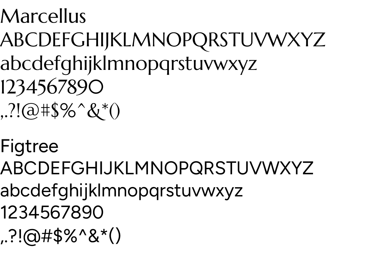
Brand typography standards were also defined as part of the logo redesign. The closes google fonts to the defined set were used to ensure consistent experience.
Marcellus (Google complement to Adobe Garamond Pro) for headlines.
Figtree (Google complement of Gill Sans MT) for body copy.
High quality images for prototyping were sourced from the web and resized to fit containers as needed.
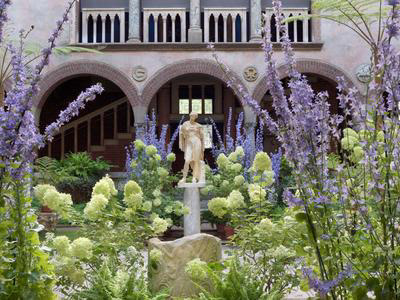
Courtyard of the Isabella Stewart Gardner Museum
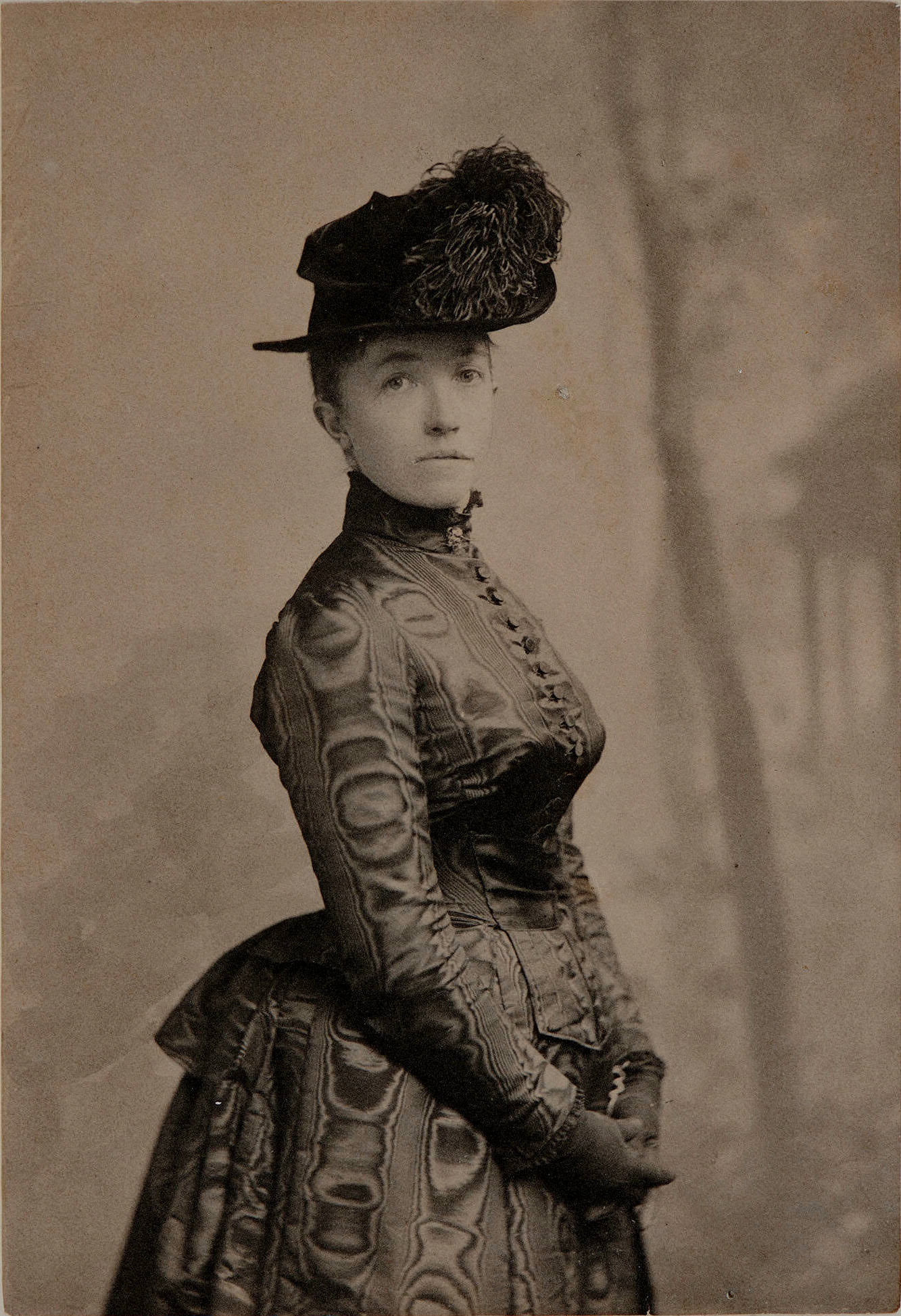
Isabella Stewart Gardner
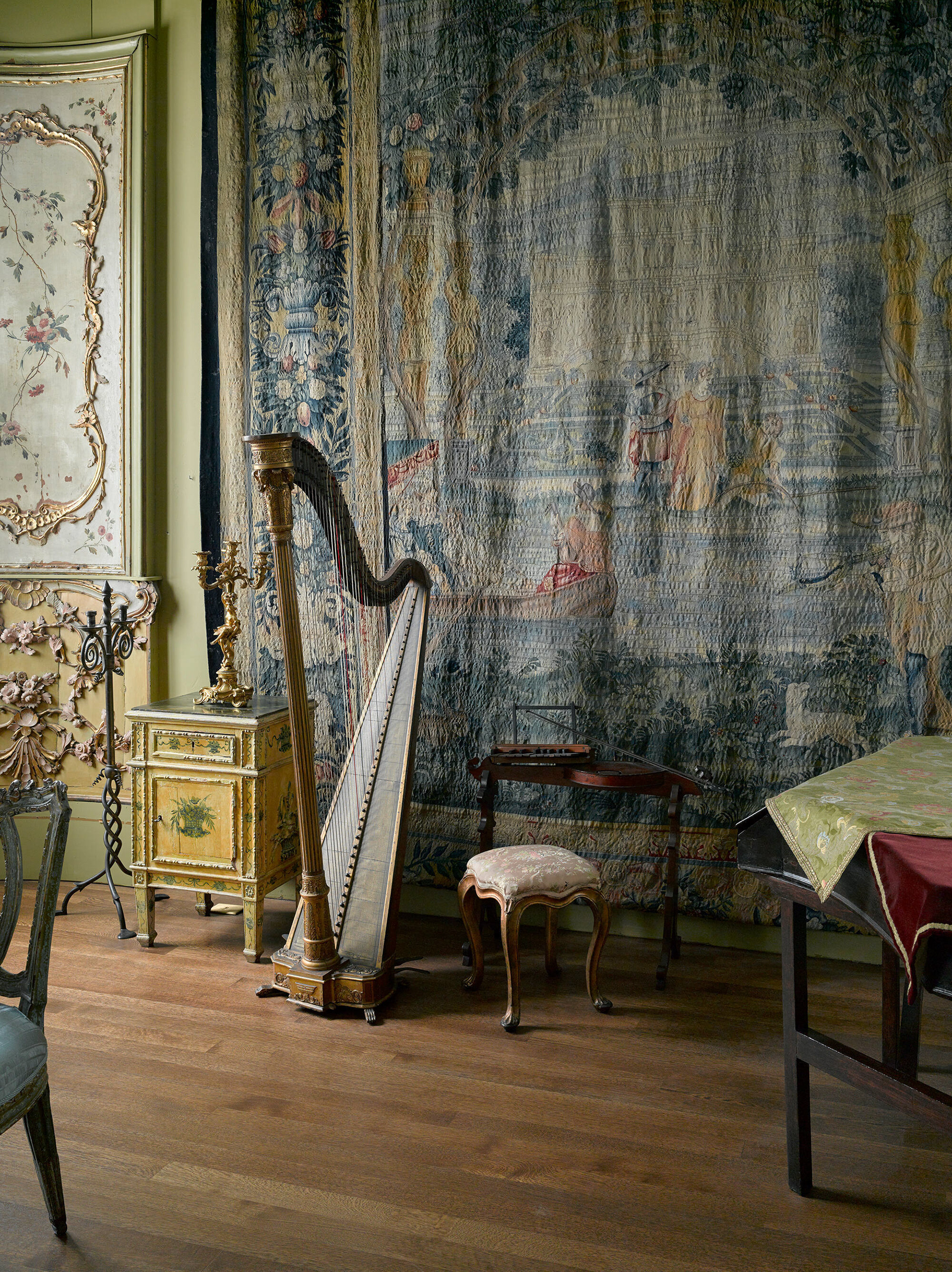
Little Salon at the Isabella Stewart Gardner Museum
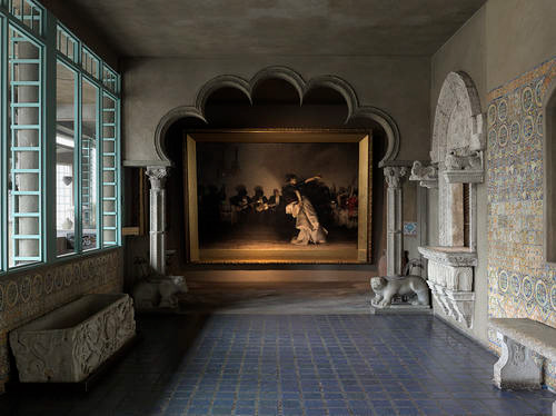
Spanish Cloister at the Isabella Stewart Gardner Museum
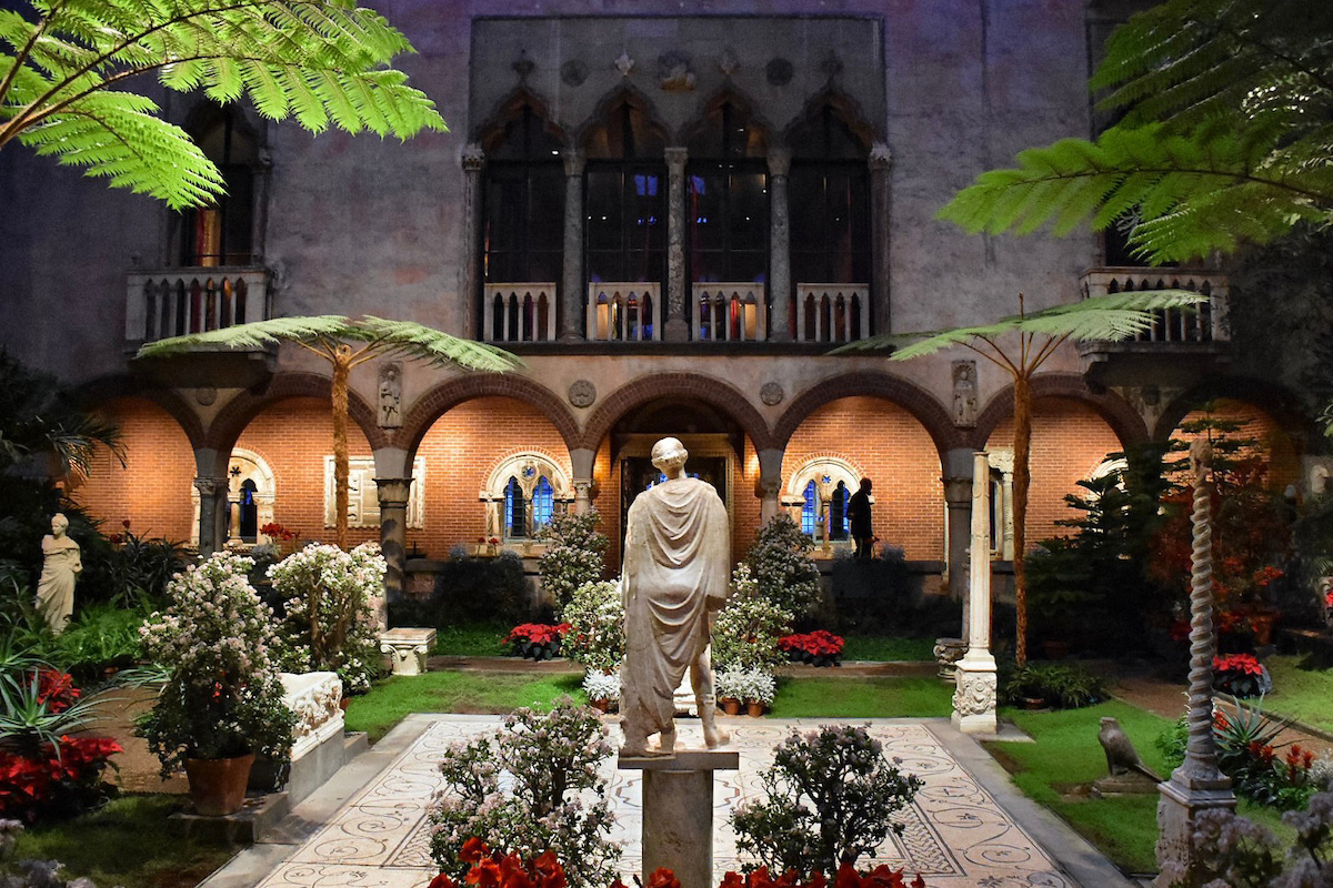
Isabella Stewart Gardner Museum Courtyard
FINAL DESIGNS
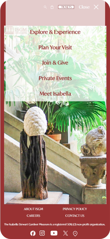
The final prototype for the landing page includes a full-screen image and hamburger menu.
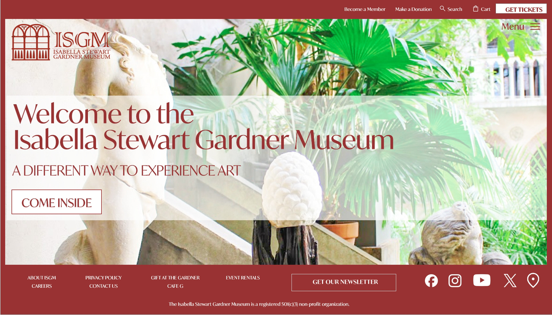
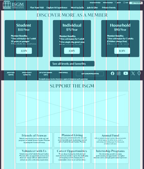
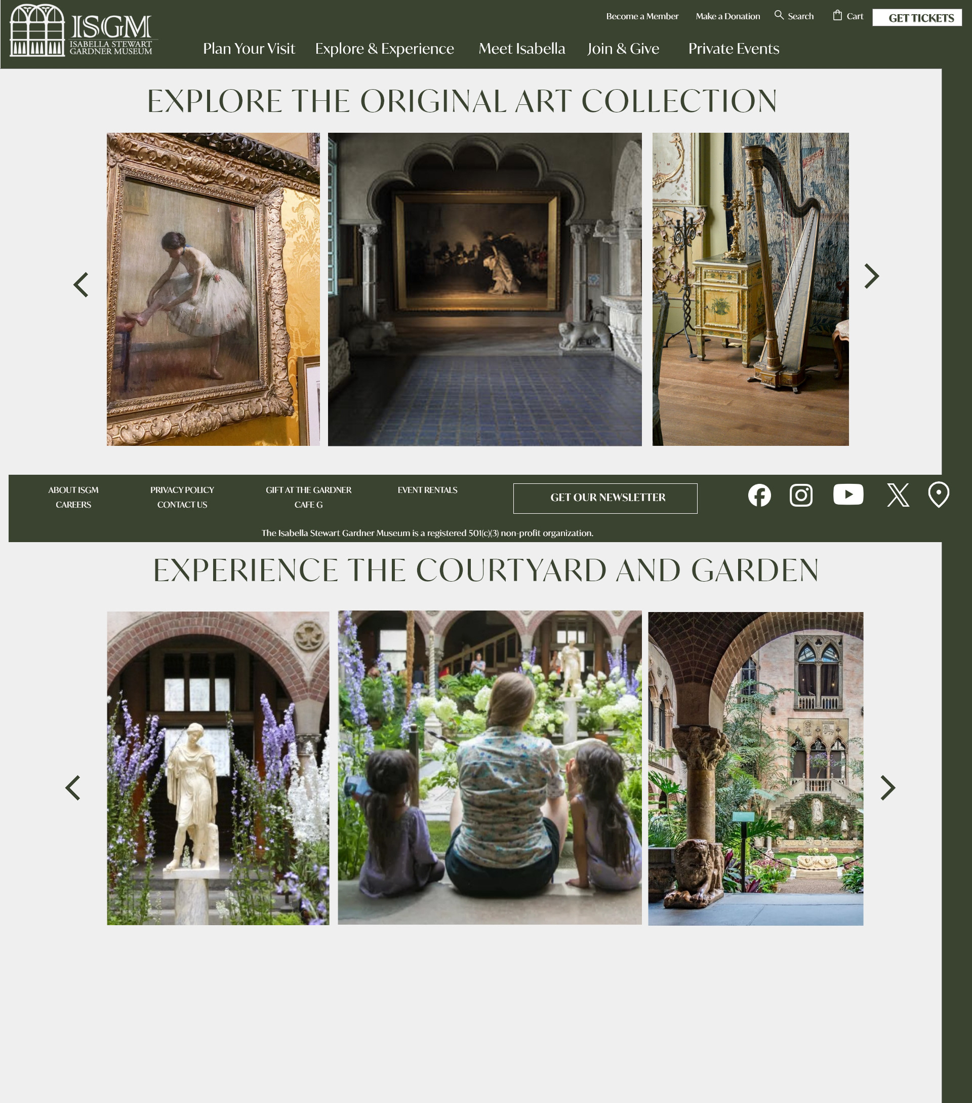
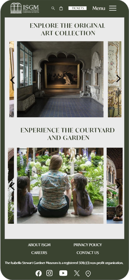
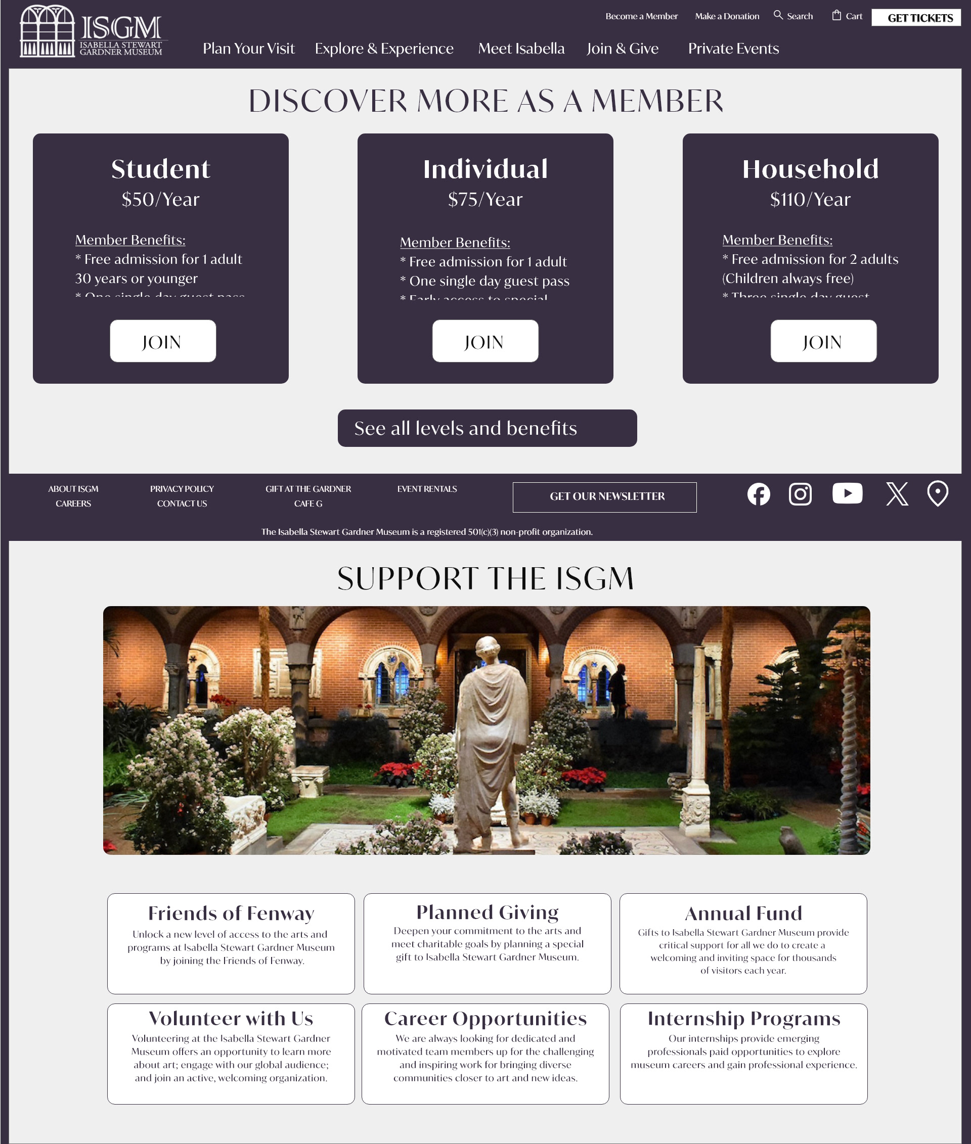
Five additional pages each have their own color scheme, providing content aligned to a specific use case in the customer journeys. For laptop/desktop viewers, the footer is fixed providing quick access to additional content and newsletter sign up CTA.
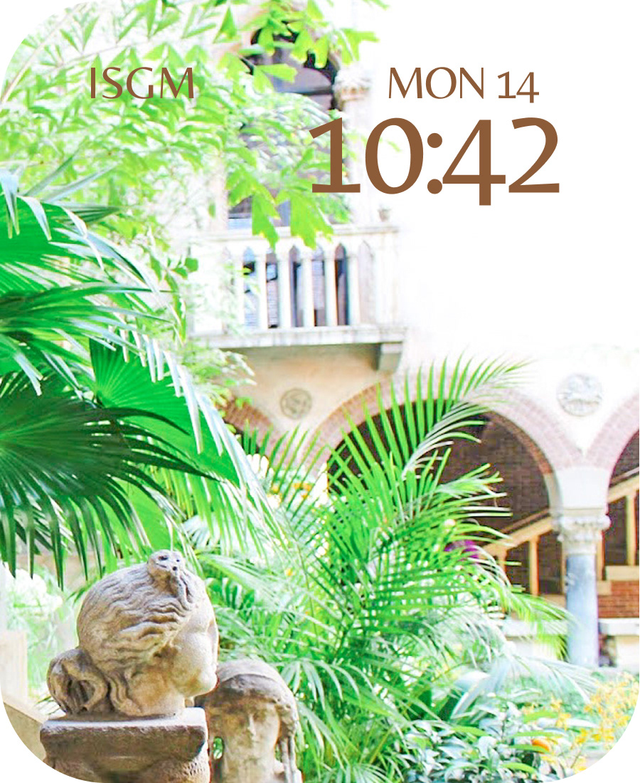
Watch faces and app screens were included as part of the design package.
LIVE PROTOTYPE DEVELOPMENT
The entire website design was developed into a live prototype using Bootstrap.
