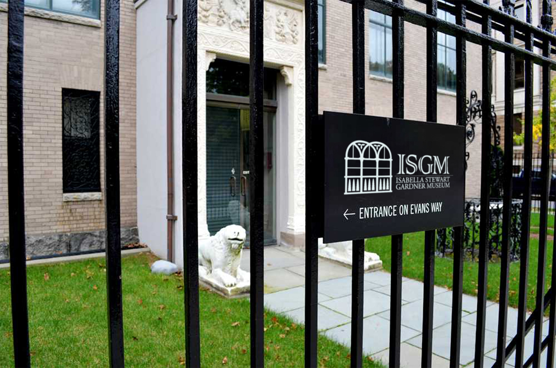
Entrance to the Isabella Stewart Gardner museum featuring redesigned logo by Wendy Steckler.
The design objective was to refresh the current museum brand identity in a way that aligns to the core values of the museum and its unique proposition of creativity, community and intimate art experiences while appealing to a modern audience. It will be instantly recognizable and used for all printed materials and promotions.
The current logo is shown below and the image above illustrates the new design.

Current logo of the Isabella Stewart Gardner Museum.
THE DESIGN PROCESS
Assembling a mood board was the first design process step as inspiration for the new logo.
The museum has a unique value proposition as it's contents and layout are not traditional. Isabella Stewart's estate established the museum in her former home. There is a stipulation that the arrangement of the artwork should not be altered and no items were be sold or added to the collection.
The building was built to evoke a 15th century Venetian palace and includes an interior courtyard that blends design elements from the Roman, Byzantine, Gothic and Renaissance periods.
The museum was the site of a 1990 art heist and empty frames continue to hang without the stolen art (first row bottom right).
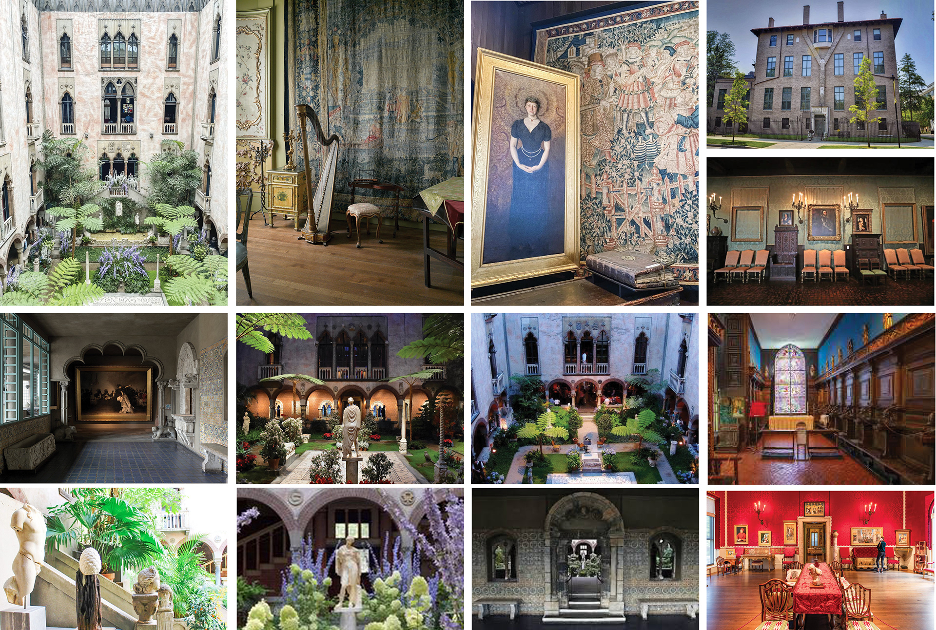
Images of the Isabella Stewart Gardner Museum courtyard and rooms.
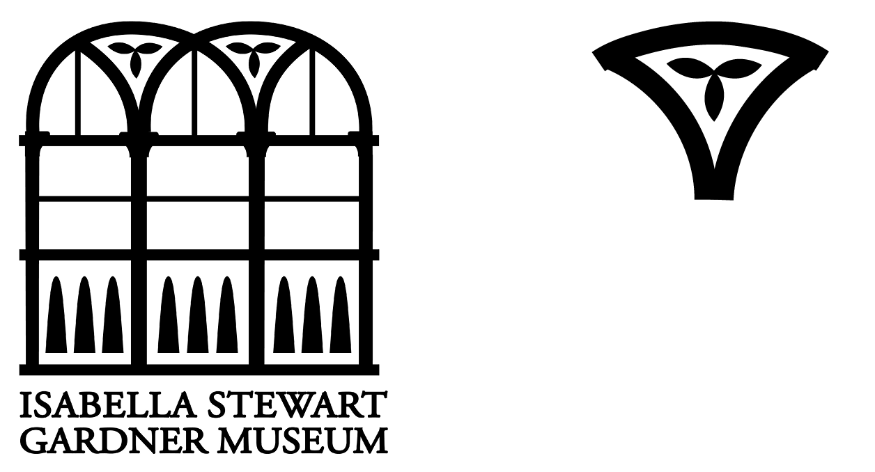
Several concepts were explored via rough sketch focusing on the ornate windows overlooking the garden and depictions of Isabella to honor her as the namesake.
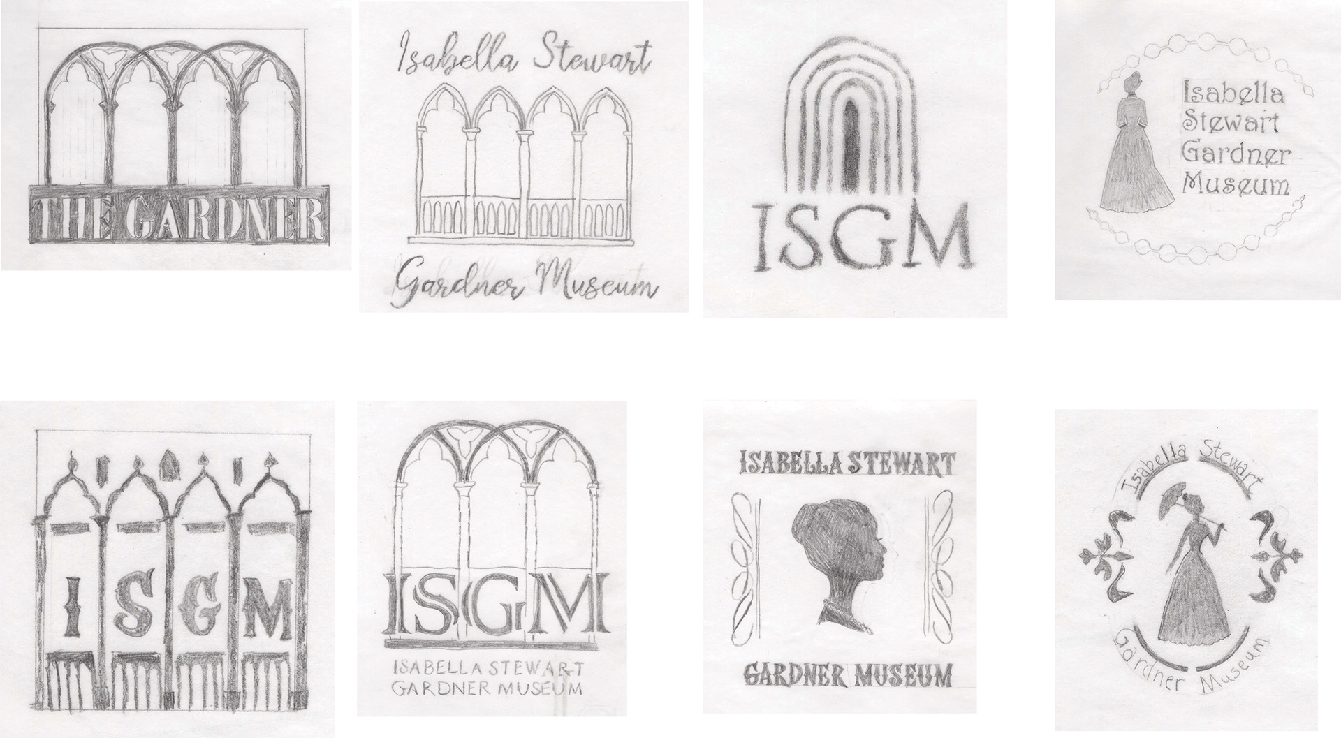
The windows are an iconic, timeless element of the museum that is instantly recognizable and of the original designs, the second bottom was chosen as the most appropriate concept to refine.
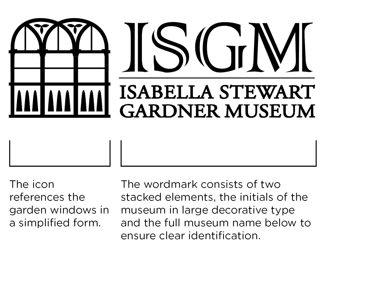
The primary logo is a combination mark with two elements; an icon and a wordmark. The icon serves as a reference to the memorable windows overlooking the courtyard while the wordmark provides additional identification.
BRAND DESIGN SYSTEM
An entire brand system was designed to accommodate all uses of the logo, including digital and print.
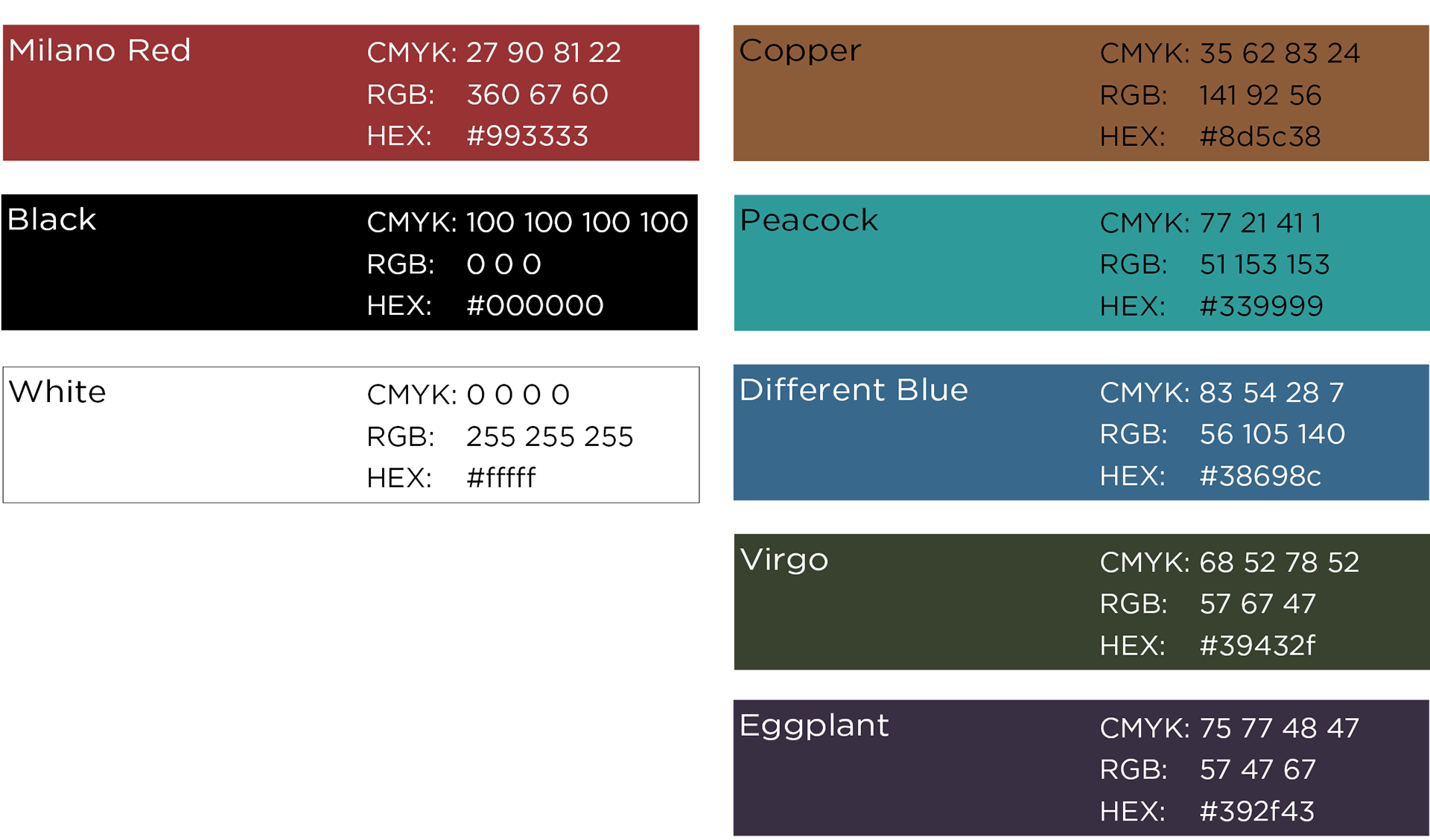
Brand colors were selected that reinforce the sense of formality, elegance and history of the museum.
A muted tone of deep red, Milano Red is the primary color balance by pure black and white. The secondary colors provide a supplemental palette of muted jeweled tones popular during Isabella's Stewart's time.
Adobe Garamond Pro was chosen as the best type for headlines and sub-headlines to convey the elegance and the elevated style of the museum.
Adobe Garamond Pro
ABCDEFGHIJKLMNOPQRSTUVWXYZ
abcdefghijklmnopqrstuvwxyz
1234567890
,.?!@#$%^&*()
Gill Sans Nova was chosen as the best compliment for body copy, ensuring clarity and modern style.
Gill Sans Nova
ABCDEFGHIJKLMNOPQRSTUVWXYZ
abcdefghijklmnopqrstuvwxyz
1234567890
,.?!@#$%^&*()
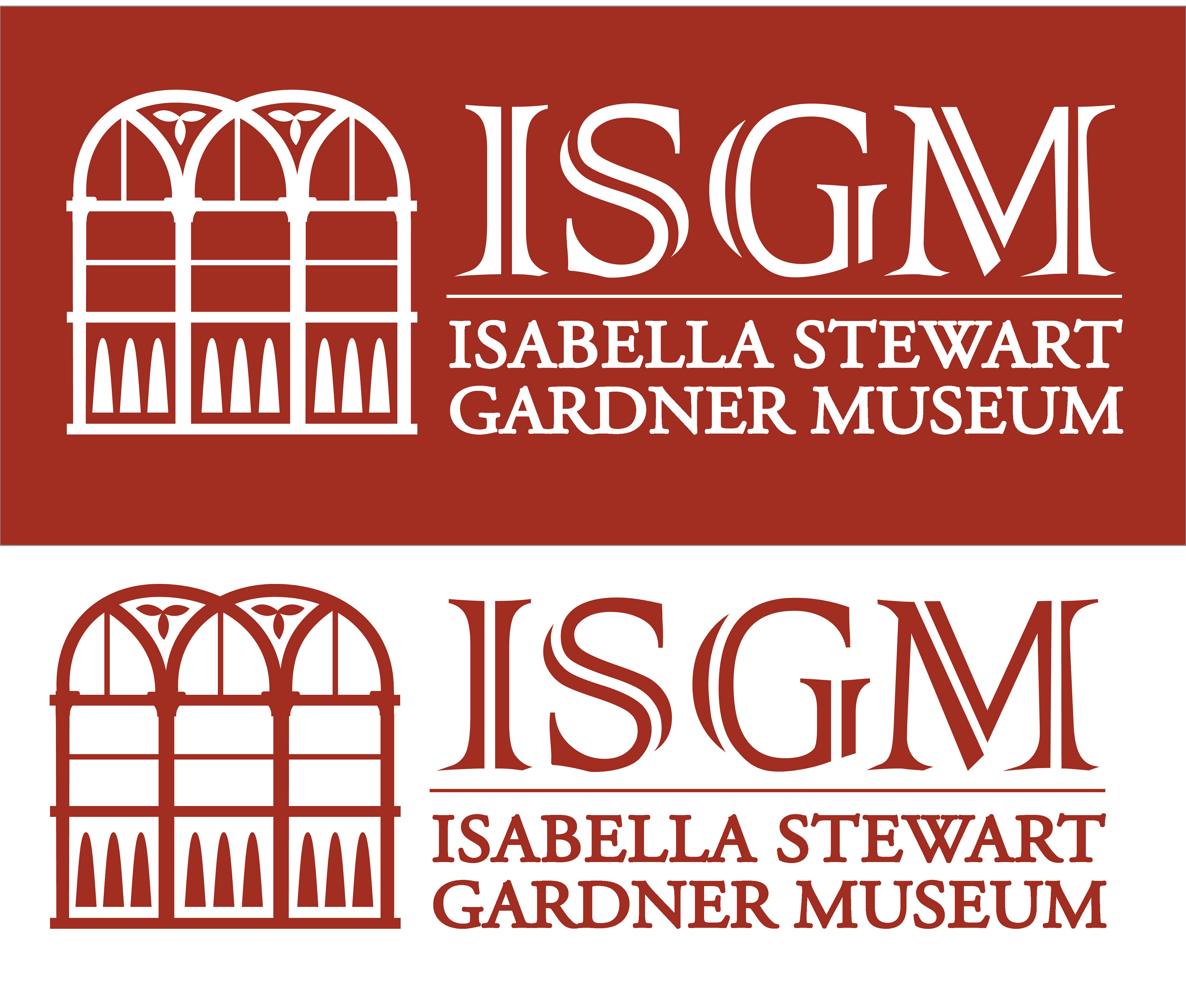
Alternative Logo versions were designed, ensuring consistent usage across all assets and implementations.
Below, a vertical oriented logo and favicon for web applications.
And alternate colors for use on color backgrounds.

FINAL DESIGN IN USE
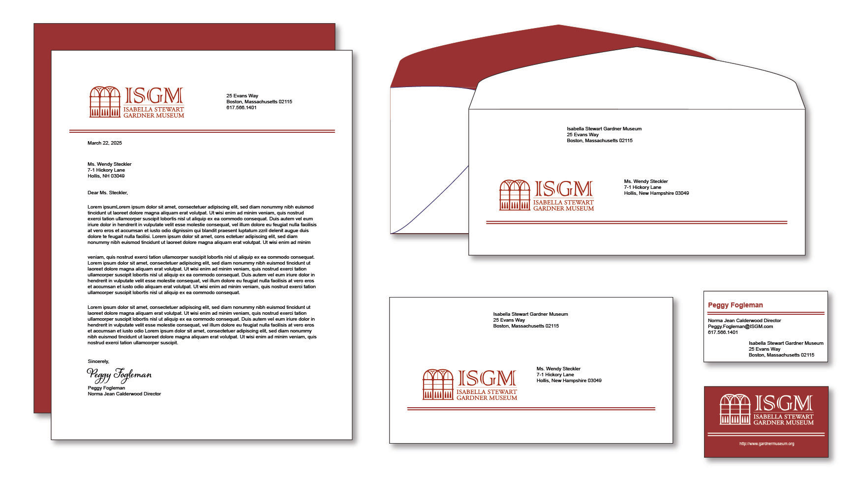
Letterhead and stationery for the Isabella Stewart Gardner Museum featuring a redesigned logo by Wendy Steckler.
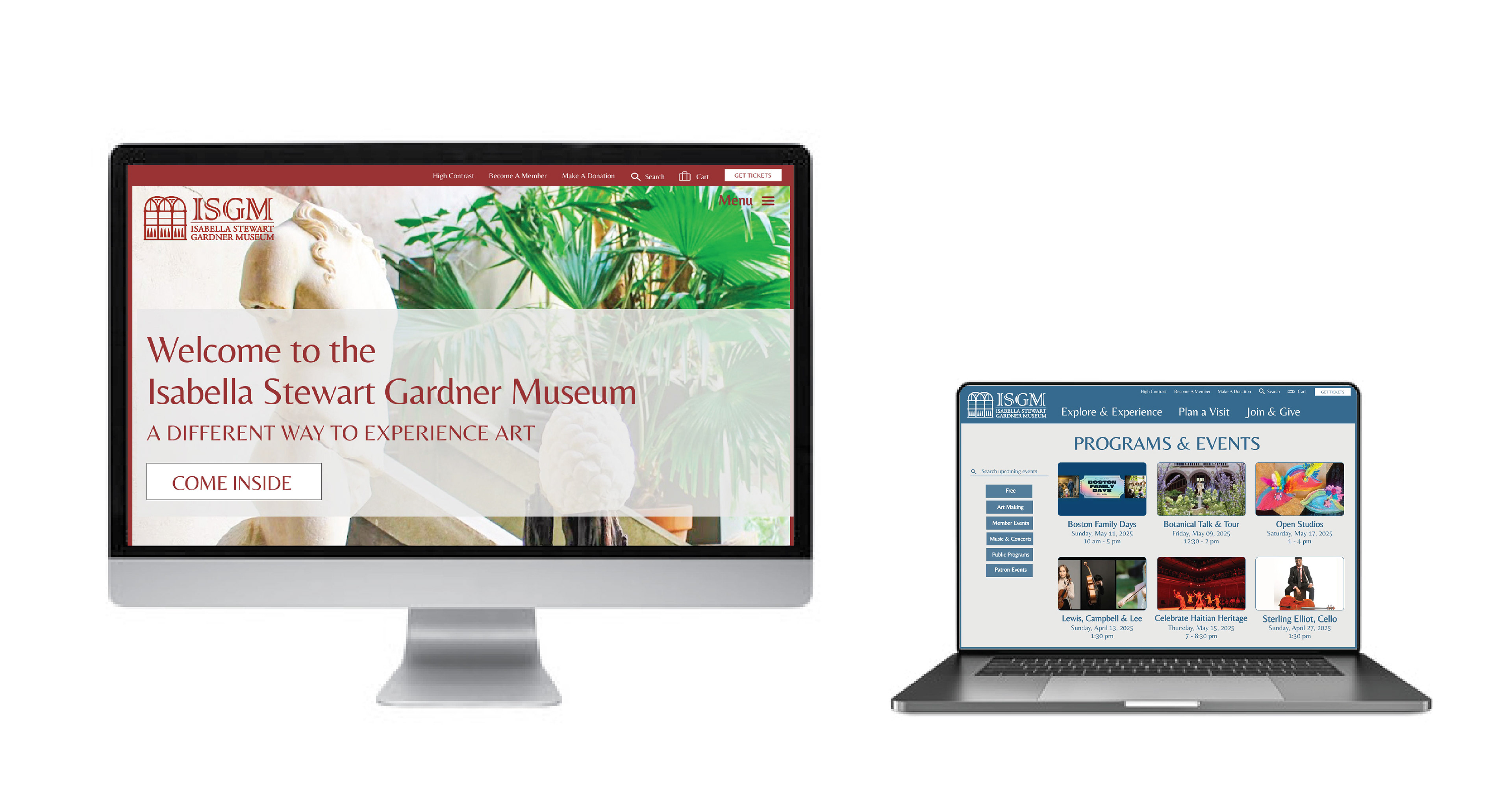
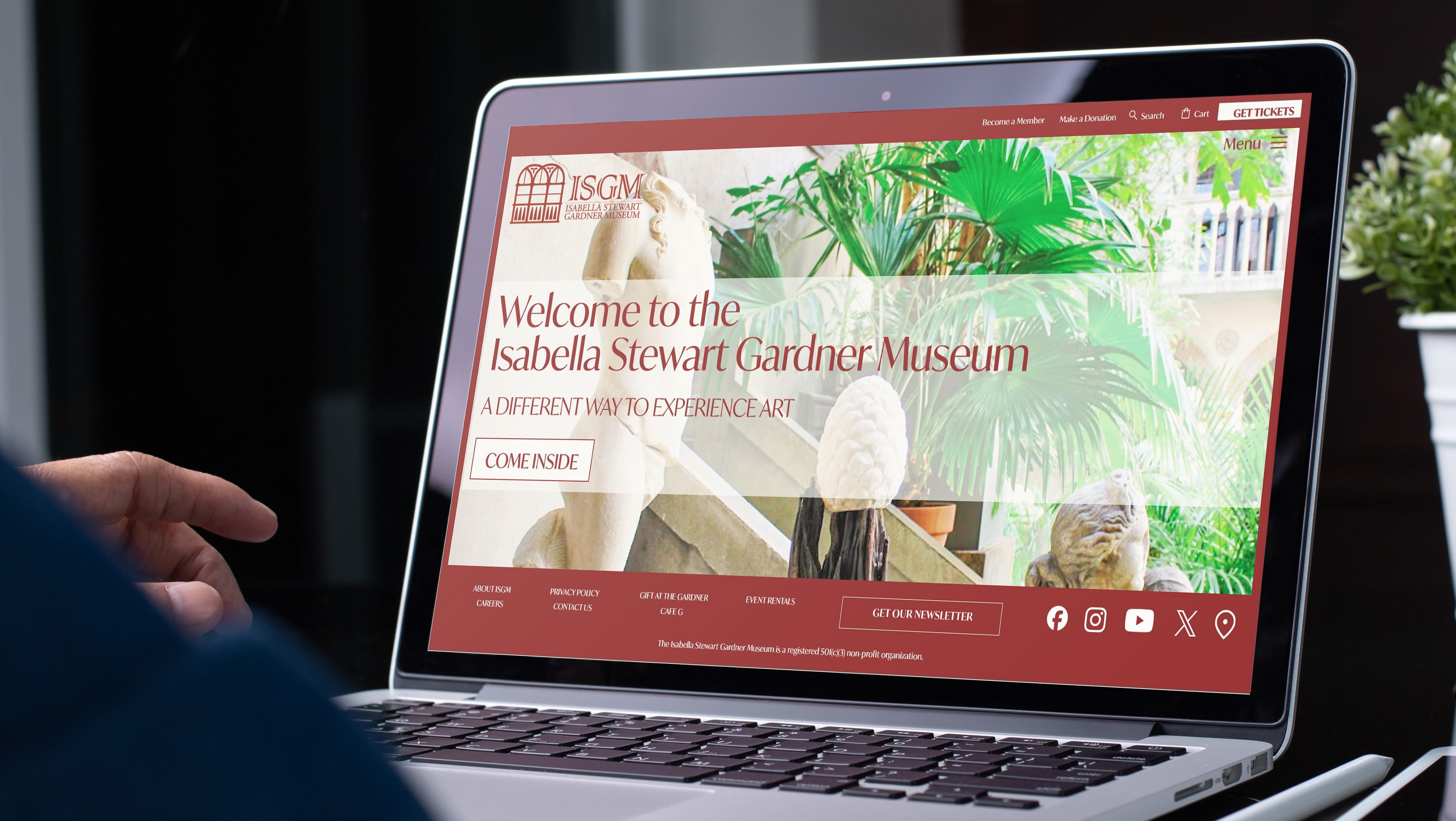
Redesigned website pages featuring the updated Isabella Stewart Gardner Museum branding and logo.
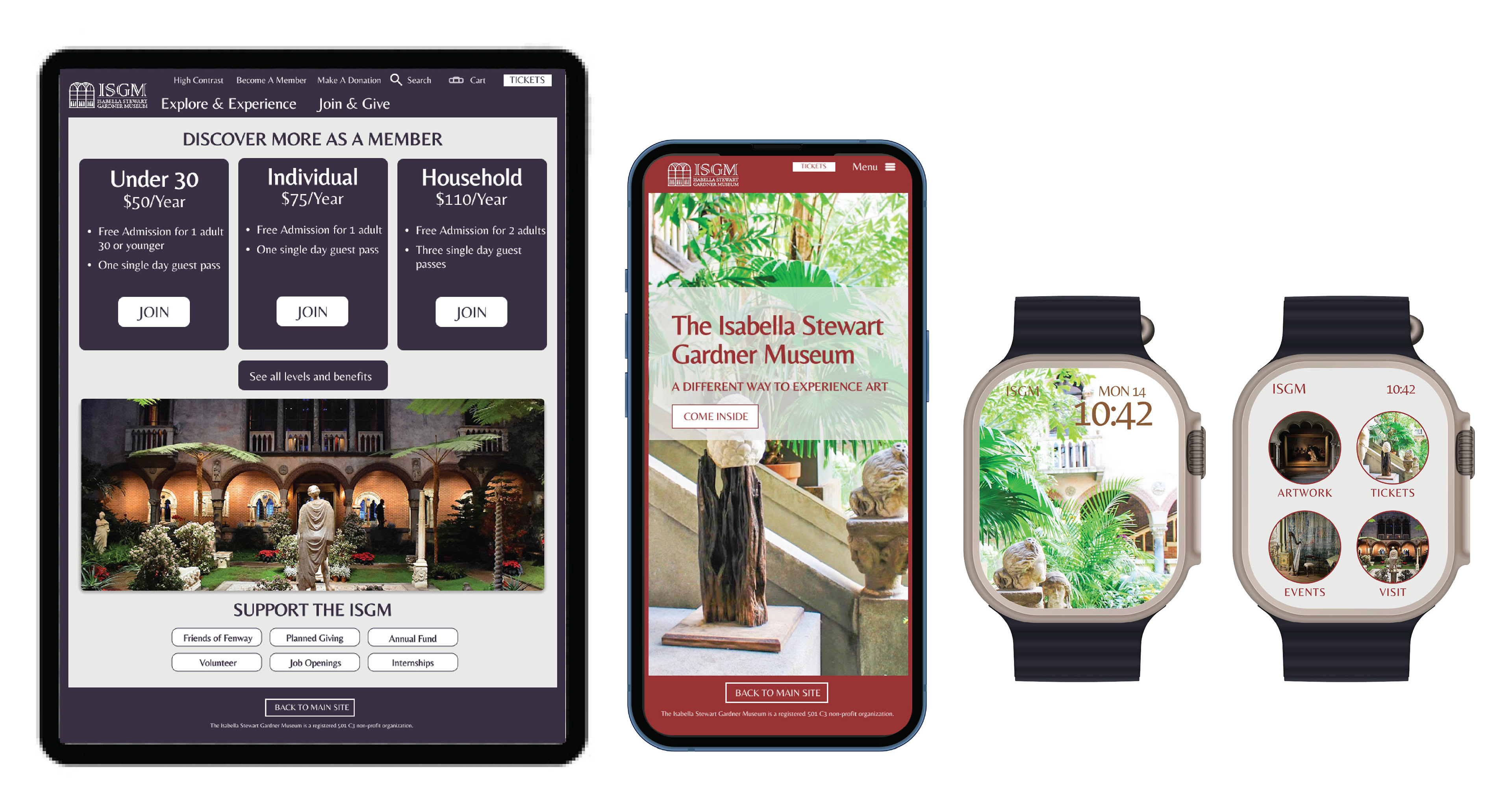
Redesigned website page on Apple ipad, landing page on iphone and app interface for Apple watch featuring the updated Isabella Stewart Gardner Museum branding and logo.