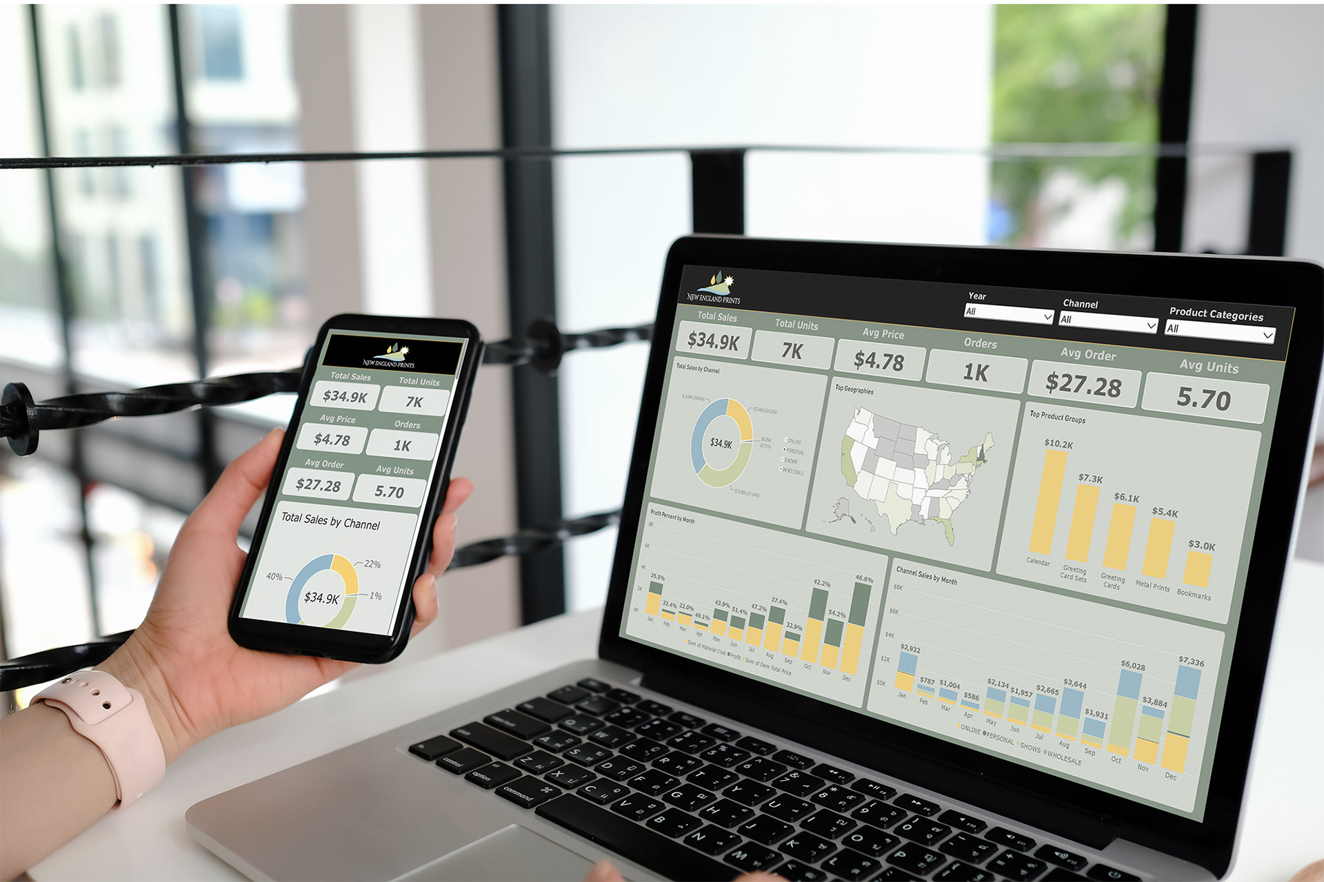
A PowerBI dashboard by Hollis, New Hampshire graphic designer Wendy Steckler
The challenge was to design a dashboard that tracked the key KPIs for my photography business. The visual design needed to be interactive and provide easy information across time, channel and product groups. The technical design needed to be supported by direct data, be accurate and easy to update from time to time.
THE DESIGN PROCESS
Stocksmith is an online system that holds all the order and manufacturing data for the entire lifetime of my business. The supporting data files for the dashboard were downloaded and organized into a local file structure.
Because the business is private, a requirement for the technical solution was to keep the data private and not publically post the data or the final dashboard.
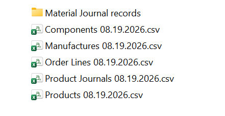
Aligning the different csv files required a study of the data, identification of keys and matching across data sets. Microsoft excel was used as an exploratory tool to identify the keys for each table and validate the definitions of column values. Audit summary values were confirmed from the raw data.
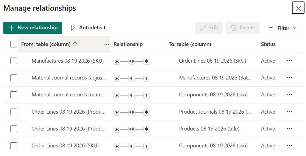
Data was loaded to Power BI and relationships were defined between tables. Transformational columns were added to the tables to create links that align data sets. Exploratory charts were created and used to validate the key KPI summary values against known audit values.
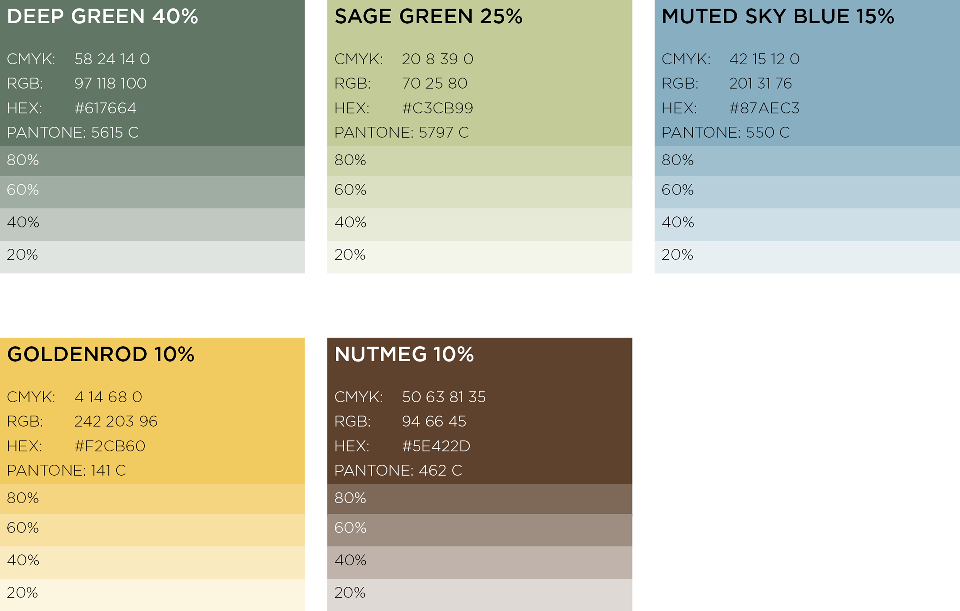
The color palette aligning to the established New England Prints brand identity and added to Power BI as a custom color scheme.
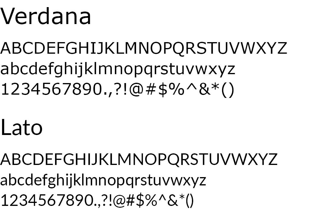
The brand logo and website use Cinzel Decorative for Headers and Lato for text, the Verdana was selected from the PowerBI default fontpack as an appropriate substitute as it is also a san-serif with high x-height and double-story a.
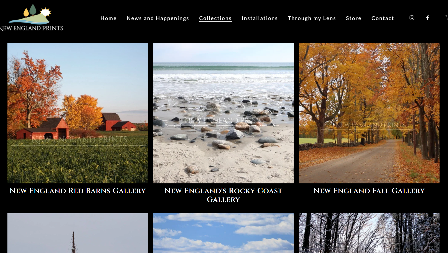
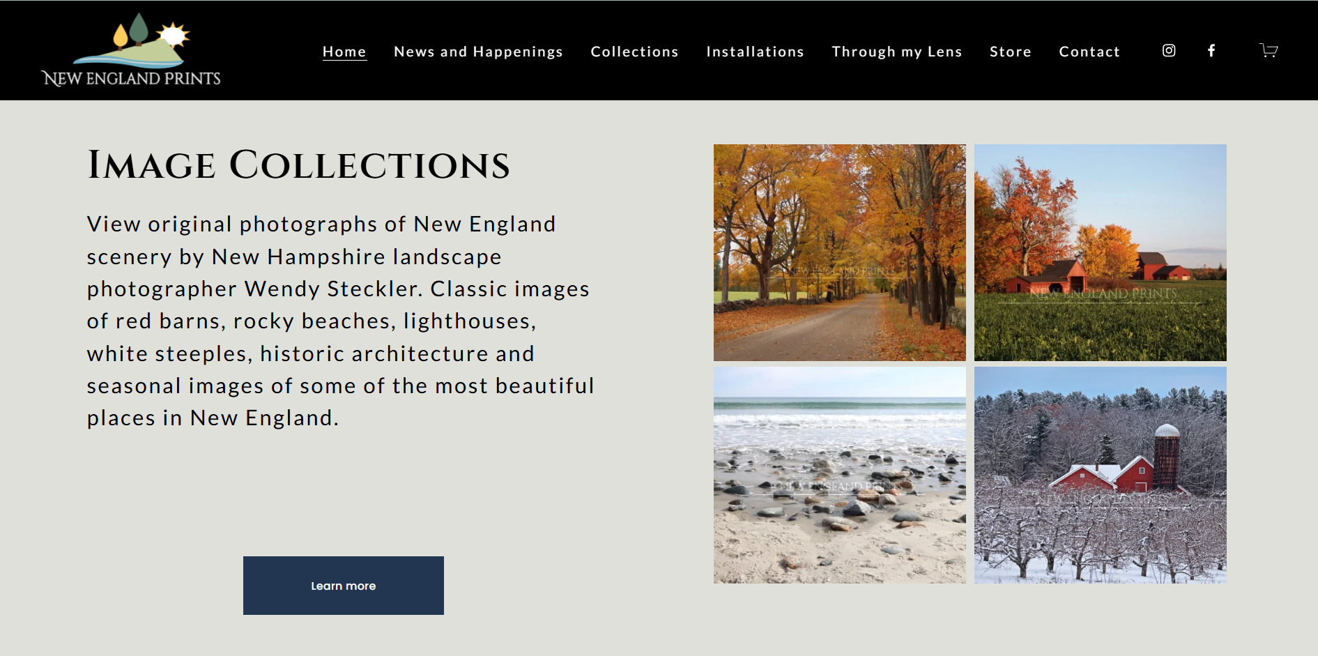
The existing New England Prints logo was added to Power BI for use in the header and the header background was set as black matching the design of the existing business website (shown below).
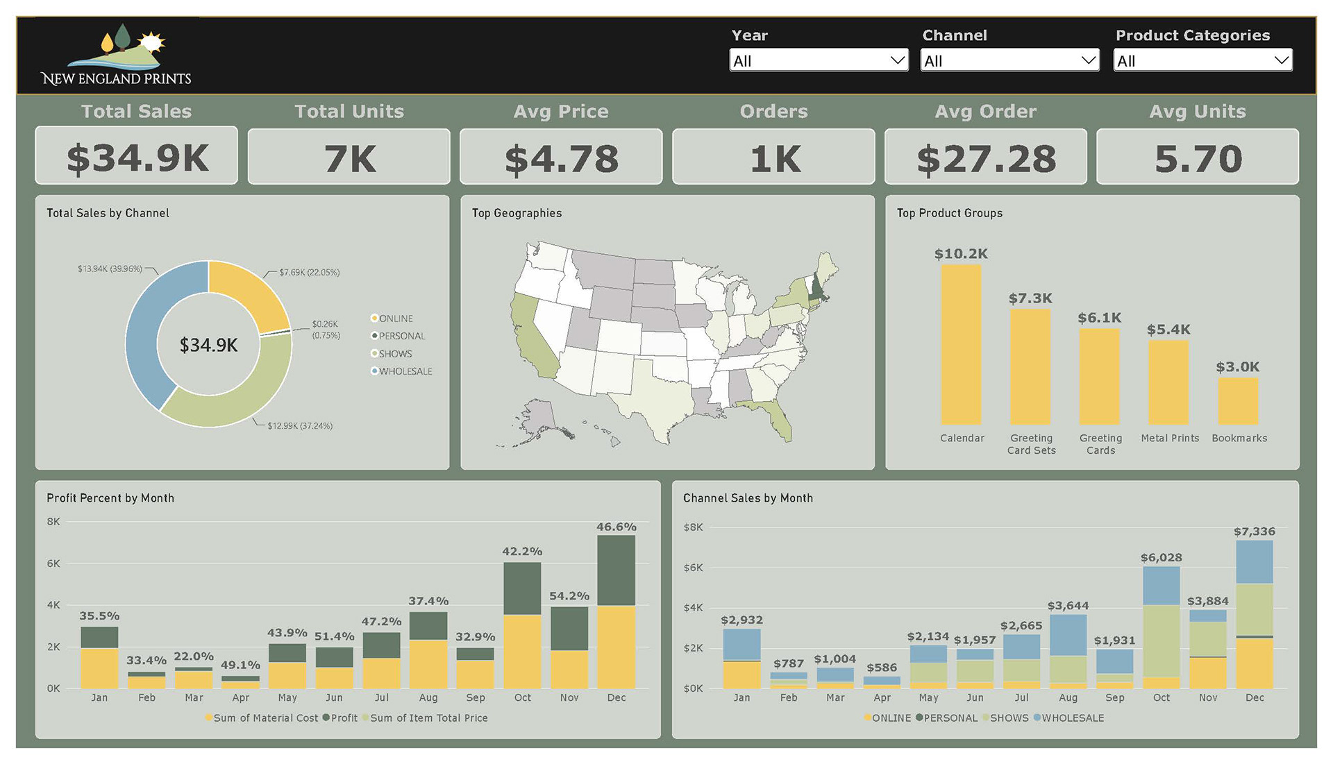
A set of key charts were designed highlighting total sales and profit over time, channel proportion, geographic penetration and a highlight of top products. Page filters were added for interactivity, including drill to specific years, channels or product groups.
A set of KPI cards were added to highlight at-a-glance view of key business metrics. These KPI cards were given the most emphasis by applying larger and bolded font to both the header and the value itself.
The layout was organized to emphasize a balanced view, it is symmetrical with strict alignment and proportions. The charts layout allows a sliver of the darker background color between each, providing enough contrast to establish rhythm on the page.
An alternate mobile-ready design provides the same information in a format that aligns with the vertical layout.
FINAL DESIGN